Posts categorized “Inspiration”.

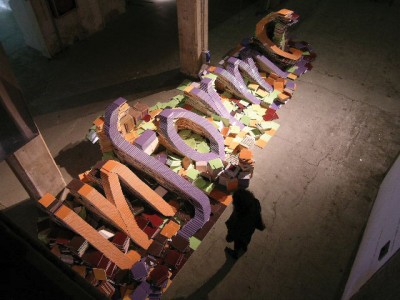
http://www.typeworkshop.com/Florence_12_2005/final-result/florence-final-07.jpg
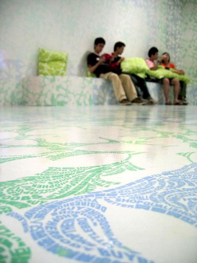
Typeworkshop.com shows various results of workshops by Underware, a design company specialized on type design and production. Students work with different media and show different approaches to thematic titles such as ‘darkmark’, ‘Movable Type’ or ‘Applied Type’.
Posted on October 10th, 2008.
Categories: Inspiration, Installation, Research.
...................................................................................................................................

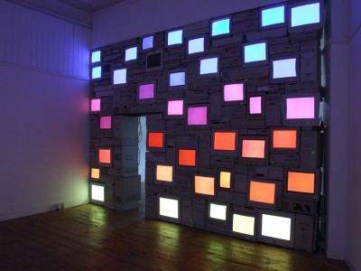
http://www.sandysmith.co.uk/artwork/computers/sunset/sandy_smith_sunset_01.jpg

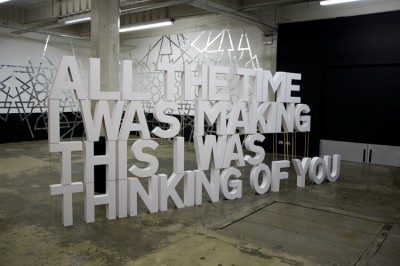
http://www.sandysmith.co.uk/artwork/poststuckism/image5.html
Sandy Smith’s ‘Mauritian Sunset’ is a wall of computers and screens and ‘Please don’t break my heart’ was made from around 100 sheets of mounting board glued together to form the sentence “All the time I was making this I was thinking of you”. It fell during the exhibition as it could not stand without scaffolding. I think in combination with the title and the text this unintended transformation due to the physical construction becomes a significant part of the art work.
Posted on September 26th, 2008.
Categories: Favorites, Inspiration, Installation, Research.
...................................................................................................................................

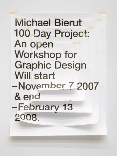
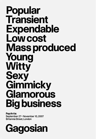
http://daniellaspinat.com/images/bierut/1.jpg
by Daniella Spinat

http://www.graphicthoughtfacility.com/images/gagosianposter_web.jpg
by GTF

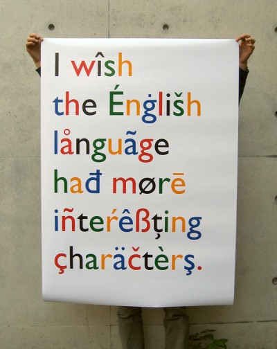
http://mciancio.com/work_images/english/english.jpg
by Michael Ciancio

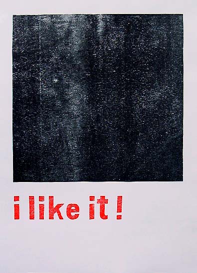
http://www.flag.cc/woodcuts/pics/woodcuts_04.jpg
by Bastien Aubry

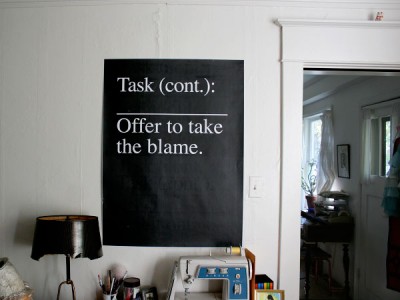
http://www.manystuff.org/wp-content/uploads/2007/08/task01.jpg
by Alex DeArmond
Posted on September 26th, 2008.
Categories: Inspiration, Poster, Research.
...................................................................................................................................

http://www.tsangkinwah.com/image/megART7.jpg
TSANG Kin-Wah makes wall installations in the form of taped text or text-patterns.
Posted on September 26th, 2008.
Categories: Inspiration, Installation, Research.
...................................................................................................................................
Posted on September 25th, 2008.
Categories: Inspiration, Research.
...................................................................................................................................

http://mikemillsweb.com/filmandvideo_br_silently.html
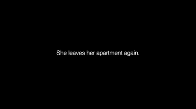
With ‘Blonde Redhead - Silently’ Mike Mills made a music video that creates images with just plain white text on a black ground describing scenes different to the lyrics of the song.
In 1959 McLuhan said “flickers, as the movies were once called, are really built into the printed form. The printed form is itself a flicker in which you are constantly transferring from this shot to that shot. This shot, the image lingers while you look at that one, and while you look at the next one, there’s a fingering, wavering, doubtful no-man’s land.” (Essential McLuhan, p.282)
Posted on September 25th, 2008.
Categories: Favorites, Inspiration, Research, Theory.
...................................................................................................................................

http://www.designboom.com/contemporary/neto/7.jpg

http://www.acegallery.net/artists/donovan/TD-UntCupsLA.jpg

http://maxprotetch.com/MEDIA/00178.jpg

http://www.re-title.com/public/exhibitors/936/archive_1940_TanyaBonakdarGallery-2.jpg
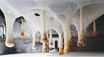
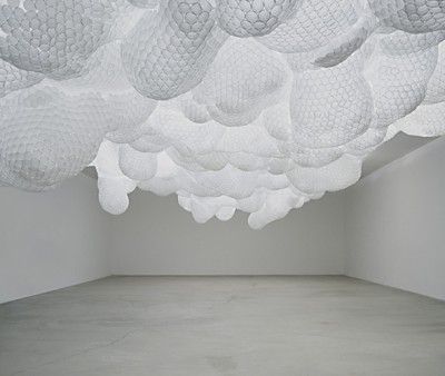
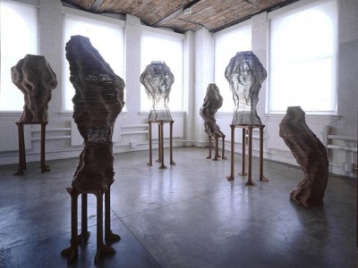
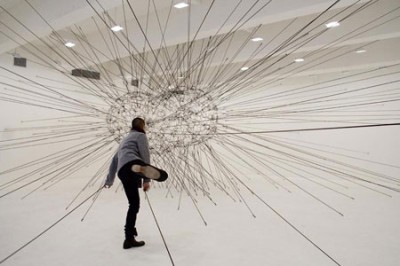
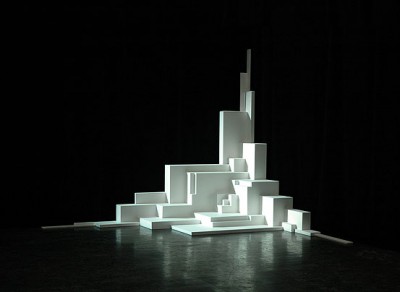
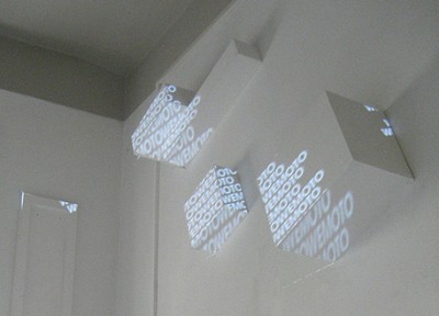
Artist work in the field of installation and sculpture: Ernesto Neto, Tara Donovan, Tomas Saraceno and Tobias Putrih give examples of creative space, usage of materials with high availability and modular construction.
Ernesto Neto is mostly working with light, flexible fabrics in nylon or cotton resulting in spaceous installations whereas Tara Donovan uses various everyday materials such as tape, drinking straws or plastic cups to form large-scale abstract floor and wall works.”She considers patterning, configuration, and the play of light when determining the structure of her works but the final form evolves from the innate properties and structures of the material itself.”(Hammer Museum, Los Angeles 2004) Tomas Saraceno used elastic rope to realize installations like ‘Galaxies Forming ALong Filaments, Like Droplets Along the Strands of a Spider’ which I got to see in New York this year. Among Tobias Putrih’s work especially the usage of cardboard or projection screens are interesting references.
Posted on September 25th, 2008.
Categories: Favorites, Inspiration, Installation, Research.
...................................................................................................................................

http://www.pablovalbuena.com/imgs/quebec.jpg

http://www.framebox.de/creations/3d/edges/till_stefan.jpg
With his
augmented sculptures and urban installation Pablo Valbuena shows great effect with a simple method. A combination of light and object at it’s best. Stefan Golz and Till Nowak were doing some light installations with a similar idea. They also used some typographic elements in
Edges but ulike Pablo Valbuena they did not project them considering the three-dimensional distortion of the projection.
Posted on September 21st, 2008.
Categories: Favorites, Inspiration, Installation, Research.
...................................................................................................................................

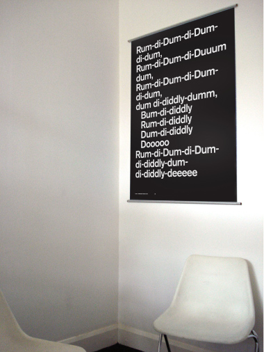
http://www.tommunckton.co.uk/images/them_tune_2.jpg
Tom Munckton explored the relationship between typography and language and designed a poster series that show how lyrics for an instrumental song could look like. Reminded me a bit of Dada but seems much more fun to me.
Posted on September 21st, 2008.
Categories: Inspiration, Poster, Research.
...................................................................................................................................
Posted on September 21st, 2008.
Categories: Inspiration, Programming, Research.
...................................................................................................................................
