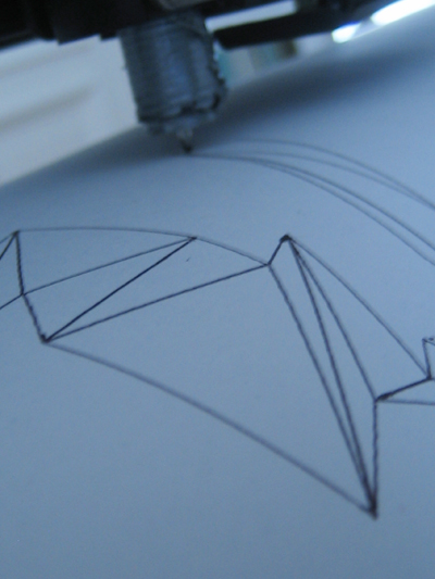
To unwrap polygons of a generated three-dimensional letter I implement an pdf-export that takes the distances between three ordered points in the 3D-space and applies trigonometric rules to calculate the angle between the first and second edge. With a series of transformations I draw each edge with the actual length and angle in 2D and close each triangle to get an printable two dimensional triangle-strip.
Posted on January 22nd, 2009.
Categories: News, Progress, Research.
...................................................................................................................................

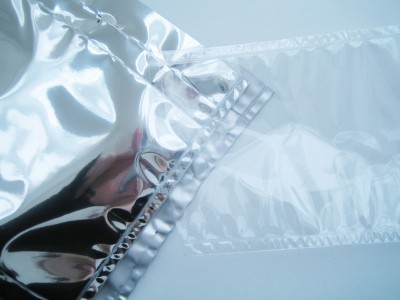
My favored material for inflatable structures would have been highly reflecting silver film. The one I tested is not suitable for welding though and wouldn’t be usable as screening surface neither.
Other plastics are easy to weld on the other hand. The process requires accuracy as there is no guidance on a common plastic welding machine…
Posted on January 3rd, 2009.
Categories: News, Progress, Research.
...................................................................................................................................

One felt-pen isn’t even enough for one of my plots and some pens are more fitting than others, so the output is very unpredictable and also is the data within one graphic too much for processing on the plotter - that limits its usage decisively. Aesthetics are unique though…
Posted on December 16th, 2008.
Categories: Favorites, Poster, Progress.
...................................................................................................................................

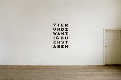
http://www.markushofer.at/img/24buchst.jpg
With further thoughts about self-reference in writing and conceptual art I found out that there are a view titles that reflect the Alphabet as their medium. Thus I came to a kind of Type Haiku:
Nine signs - Ten letters - Eighteen characters
Since one characteristic of the Alphabet in comparison to others is that you can translate various languages in it, I found the same Idea in German. Markus Hofer does some text-based art as well as installations or sculptures that point out our surrounding’s objects and media. His work ‘VIERUNDZWANZIG BUCHSTABEN’ (twenty four letters) does the same as described above.
Posted on November 7th, 2008.
Categories: Favorites, Progress, Research.
...................................................................................................................................

Eventually I have three different versions of the TrueType designed. The original one for usage on screen, print and as source of font outlines for programming. The second version is for plotting with a felt- or ball-pen. It consists of multiple lines to get a kind of hatching that makes a filled type when rendering. The third one is for cut outs and therefore contains gaps to leave some paper as the shapes become holes.
Posted on October 19th, 2008.
Categories: Favorites, Progress.
...................................................................................................................................


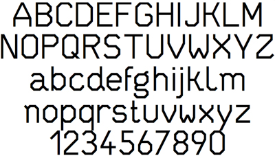
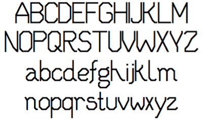
(On the top you see the final TrueType font whereas the image below shows the very first version)
The font was to be simple, clear, neutral. It should consist of unambiguous characters with good readability. Moreover the typeface should work fine in small point-sizes as well as in huge format - on the screen, in print and sculpture.
Because of different reasons a classic commercial font is not an option: First, because of the installation’s aspect of Zeitgeist - on one hand the installation should be timeless and matter-of-fact on the other hand it should suit a contemporary feeling for aesthetics (A font like Helvetica, Avenir or Blender are overused, impersonal and loaded with associations). A self-made font can be designed and adjusted to one’s actual and desired needs and does not involve any licensing or costs. An individual Type is therefore very important as it is the element on which all other designs base on. I decided to design an edgy font to get some suspenseful differences through varying sizes. Thus it also contains just straight lines and no curves what makes its coordinates easier to translate into different media.
A closer look at the font development shows that I started with more obviously varying shapes that formed a much more diversified face. In small continuous text or viewed from distance the first versions of the character set look too reserved and female though, so that I went on with more uniform and rather blunt letters. Other than that I mainly changed proportions.
To realize the TrueType I used the online application on fontstruct.com. Here you basically build up each character in a pixel-like grid and lets you choose between different modules for this. Finally it offers the possibility to apply ‘filters’ to the whole character set before generating a TrueType. I welcomed that since I could very much need that for easily generating a kind of line patterned font.
Fontstruct has limited features and conversion algorithms so that I needed to retouch the font with a font editor. I used the free software Font Forge for that purpose.
Posted on October 18th, 2008.
Categories: Favorites, Progress, Tools.
...................................................................................................................................
