Posts categorized “Research”.
Image links to projects:

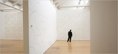
http://graphics8.nytimes.com/images/2007/04/20/arts/design/21lewi600.jpg
Drawing Series… by Sol LeWitt (Wall drawings at Dia: Beacon, NY)

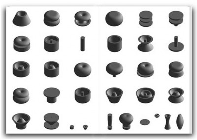
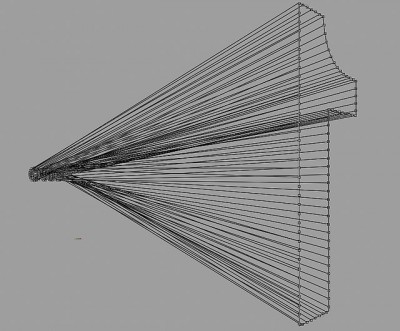
Univers Revolved by Ji Lee (Three-dimensional alphabet)

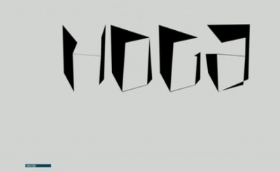
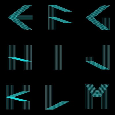
On/Off by Hoax (Series of typographic experiments)

All The Dots, Document 1 by Alex Dipple (Conceptual Art)

Projects 94 by Henrick Olesen (Installation at MoMA, NY)

Letter Flow by Roi Sabarov (Four-dimentional typography)

Takeluma by Peter Cho (Sound symbolic alphabet)


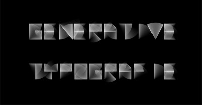
Generative Typografie at UoAS Mainz, Germany

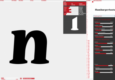
prototyp-0 by Yannick Mathey (Automated type design/ tool)

Process: Typeface by Randall Church (Generative Typography)

Lemniscate by Rosy Gorolova (Typeface)

Processing: Font code2 by Capo Luiz (Computational Typography)

one=1 by onebyone gallery (Installation)

FREE by Sean Martindale (Installation)

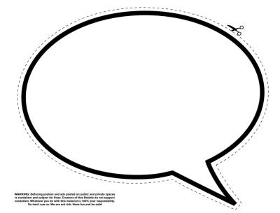
The Bubble Project by Ji Lee (Streetart)
Posted on September 12th, 2011.
Categories: Favorites, Generated, Installation, Interactive, Processing, Research, Tools, Writing.
...................................................................................................................................

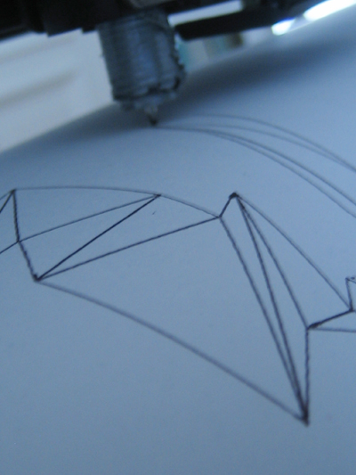
To unwrap polygons of a generated three-dimensional letter I implement an pdf-export that takes the distances between three ordered points in the 3D-space and applies trigonometric rules to calculate the angle between the first and second edge. With a series of transformations I draw each edge with the actual length and angle in 2D and close each triangle to get an printable two dimensional triangle-strip.
Posted on January 22nd, 2009.
Categories: News, Progress, Research.
...................................................................................................................................

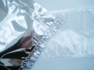
My favored material for inflatable structures would have been highly reflecting silver film. The one I tested is not suitable for welding though and wouldn’t be usable as screening surface neither.
Other plastics are easy to weld on the other hand. The process requires accuracy as there is no guidance on a common plastic welding machine…
Posted on January 3rd, 2009.
Categories: News, Progress, Research.
...................................................................................................................................

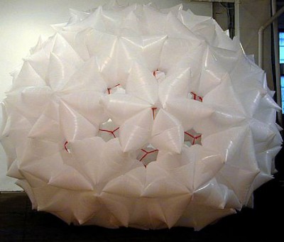
http://www.conoranddavid.com/images/large/000003A.jpg
by Conor&David

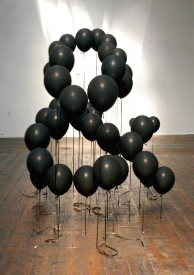
http://mocoloco.com/art/archives/steinhilber_apr_05.jpg
by Dan Steinhilber

http://nymag.com/daily/entertainment/2008/07/video_street_artist_joshua_all.html
by Joshua Allen Harris
Dan Steinhilber works with all kinds of everyday materials and objects like trash-bags, bottles or paper-cloth-hangers. He uses them as modules or media to create abstract organic sculptures.
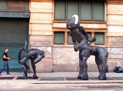
Street artist Joshua Allen Harris even brings his creatures made of garbage bags and tape to life.
He tapes them to a sidewalk grate and every time the subway passes the underground exhaust inflats and animates the sculpture that first just looked like ordinary trash on the street.
Posted on December 23rd, 2008.
Categories: Favorites, Inspiration, Installation, Research.
...................................................................................................................................

http://www.atmostheory.com/projects/commands/01.jpg

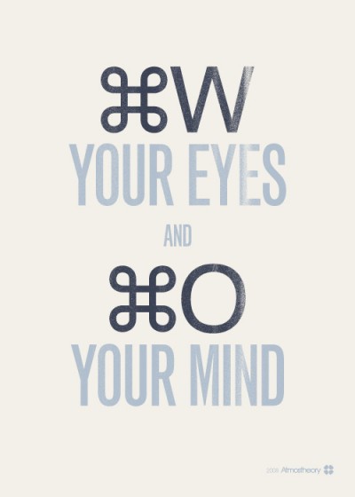
above: not funny at all - sort of funny - just humorous - funny but not ‘lol’ - genuinley funny - ‘lol’ - very funny - mockingly funny
Posted on December 22nd, 2008.
Categories: Poster, Research.
...................................................................................................................................

http://www.jenstark.com/sculpture_17.html
by Jen Stark

http://www.deitch.com/files/slideshows/swoon_work_5.jpg
by swoon

http://www.123buero.com/img/projects/PublicProjects/PublicProjects_06.jpg
by 123buero

http://www.thomasdemand.de/
by Thomas Demand

http://www.fredriksterner.com/Bildmaterial/odetolaserprinter/laser3.jpg
by Fredrik Sterner

http://anfischer.com/wp-content/uploads/indizes/anfischer_indizes_1.jpg
by Andreas Fischer

http://www.deffekt.ch/wordpress/wp-content/gallery/p8/p7181409.jpg
by Martin Fuchs / deffect

http://www.pierrevanni.com/portfolio.jpg
by Pierre Vanni
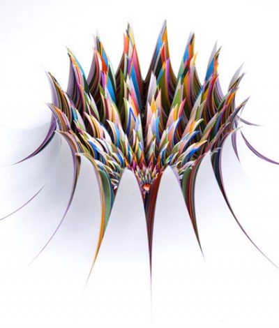
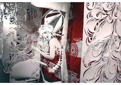
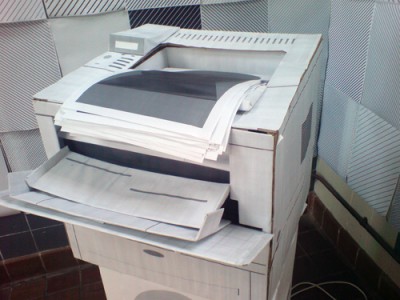
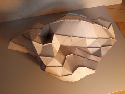
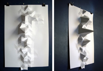
Paper sculpturing has become commonplace in contemporary visual culture. Paper is not only seen as planar two-dimensional canvas any more to write, print or draw on. It rather becomes an affordable and multi-functional material for uses such as building miniature models to sculpture surfaces and large scale objects. Artists using paper as their favorite medium come from very different fields. Swoon is part of an international street art scene but also gets featured in various galleries. On the street the decay of the material becomes part of the artwork what is not given in the gallery though. So location influences the aesthetics of her work.
In Thomas Demands photographic work, paper and location play a very different role. He uses paper to build exact models of locations that were specific happenings once took place. Lightning and perspective let the photographs look almost like reality.
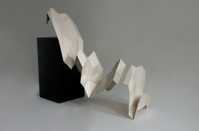
The examples of Andreas Fischer and Martin Fuchs applied digital production methods and used data input to create specific shapes. Thus paper sculpture becomes a kind of physical representation of information graphs or mathematical calculation.
Robert Lang talks about Origami as art-form or form of sculpture which has been around for hundreds of years but totally changed it’s face once combined with mathematics. The mathematic rules of modern Origami however could be defined in simple four laws: The two colorability, at any interior vertex the ‘mountain-’ and ‘valley-folds’ always differ two, angles around a vertex sum up to a straight line and a sheet can never penetrate a fold (no self-intersection at overlaps).
These rules are as simple as an computer could understand them what makes Origami a mean of digital production, rapid prototyping and simulation not only in areas like science and technology.
To enable a kind of origami on demand Robert Lang developed ‘treemaker’ - a program to generate crease patterns after a given definition of a stick-figure-like version of one’s design. The basic principal of a crease pattern is to create as many flaps as needed for the final object so what ‘treemaker’ mainly does is to calculate and output the packing of circles on the sheet.
(www.ted.com/index.php/talks/robert_lang_folds_way_new_origami.html)
Posted on December 21st, 2008.
Categories: Favorites, Inspiration, Installation, Poster, Research, Theory.
...................................................................................................................................

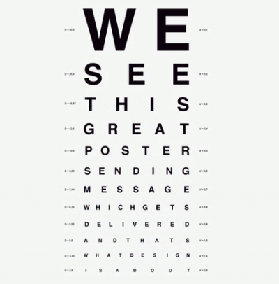
http://www.flickr.com/photos/presentday/2249802750/
by Piotr Fedorczyk

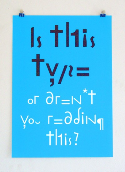
http://www.lennartwolfert.nl/posters/is-this-type/
by Lennart Wolfert
Posted on December 16th, 2008.
Categories: Poster, Research.
...................................................................................................................................

http://farm4.static.flickr.com/3212/2739457894_2b10257c23_o.jpg
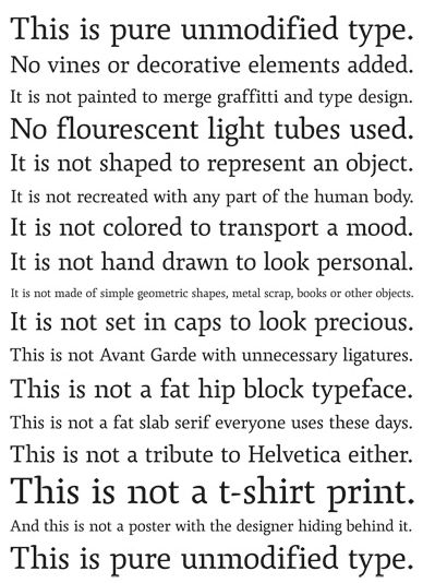
above: ‘This is pure unmodified type. No vines or decorative elements added. It is not painted to merge graffiti and type design. No fluorescent light tubes used. It is not shaped to represent an object. It is not recreated with any part of the human body. It is not colored to transport a mood. It is not hand drawn to look personal. It is not made of simple geometric shapes, metal scrap, books or other objects. It is not set in caps to look precious. This is not Avant-Garde with unnecessary ligatures. This is not a fat, hip block typeface. This is not a tribute to Helvetica either. This is not a t-shirt print. And this is not a poster with the designer hiding behind it. This is pure unmodified type.’
Posted on December 13th, 2008.
Categories: Favorites, Inspiration, Research, Theory.
...................................................................................................................................

http://toxi.co.uk/p5/base26
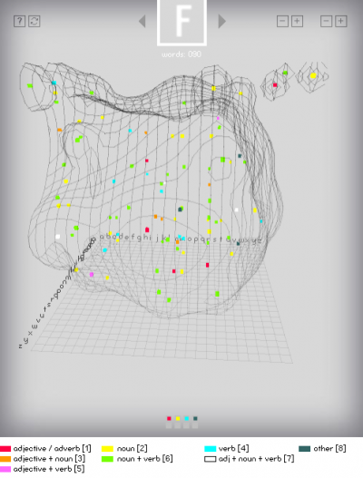
Because four-letter words have a special status in the English language and culture ‘base26′ was done to give an overview of (almost) all English four-letter words and to visualize their relations to each other.
Each point is a presentation for a four-letter-word with a position based on 4D coordinates for x,y,z and time. The colors indicate types of words and the wireframe surface depicts the frequency of occurence of letter combinations. (toxi.co.uk/p5/base26)
Posted on December 12th, 2008.
Categories: Generated, Processing, Programming, Research.
...................................................................................................................................

http://upload.wikimedia.org/wikipedia/commons/e/e9/Metal_type.svg
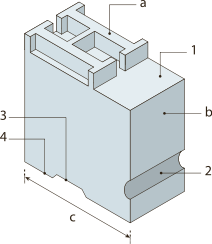
On the 21. of March the CCC published a conversation with Thomas Maier on the history of typography at a glance. Starting with the early evolving of script and the application of copper engraving Thomas Maier exemplifies the invention of book-printing and Gutenberg’s printing technique. Moreover he talks about technical specifications and about some related topics like copyright and standard paper formats. He later describes the transition from using Line-setting systems to the usage of punched tape, telegraphic systems and typewriters and further the offset print and Phototypesetting. Finally he comes to the chapter of digitalized fonts.
From 1900 on it was just when the variety of type-designs grew with the replacement of the lead and not before 1965 the script became digital while Photocomposition was the latest font-setting technique. Through photo-scans fonts could be fragmented into multiple points. One of the first systems for that was Rudolf Hell’s ‘Digiset’. In 1975 Fonts got described through digital data with the help of the Ikarus-system. Originally this system was used to cut letters with a cutting machine to achieve stencil-like films for Phototypesetting.
Here letters could be described through Bezier curves by defining the position and kind of each point on the letter-shape and this input data was then stored on punched tape. This technique enabled the calculation of bitmaps from vector images which could be directly applied to the Photocomposition. From this approach later in the 80ies PostScript evolved.
Nevertheless Thomas Maier sees the decisive turning point for the development towards digital font in automated punch-cutting via a pantograph during the industrial revolution. For the first time script was seen as being specified by its contour. Before that a letter was ‘a plane thing’, with punch-cutting the translation of the line that was to mill defined the shape. This view was required to invent Linotype and the digitalizing for the Ikarus system.
In the 80ies a combination of corporate activities result in the development of a series of font formats. Apple introduces the personal computer, Adobe implements the programming language PostScript for the description of site contents such as format, graphics and font. Later Adobe releases PDF, Aldus designs Pagemaker and with its release establish Desktop Publishing. Eventually Linotype supplies a driver for PostScript.
Because of Licensing Apple develops a own font format which technically and mathematically was akin PostScript and that lead to the release of the TrueType format Type 1. Then some more TrueType formats and Opentype were to follow before PostScript finally became open source.
Opentype is unique as it has a two-way method to treat script. For the first time character and glyph, i.e. meaning and form, were seen as independent. This made a range of micro-typographic issues such as ligatures possible.
Posted on December 11th, 2008.
Categories: Research, Theory.
...................................................................................................................................
