Posts categorized “Favorites”.
Image links to projects:

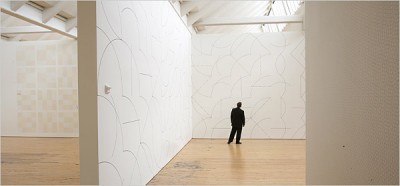
http://graphics8.nytimes.com/images/2007/04/20/arts/design/21lewi600.jpg
Drawing Series… by Sol LeWitt (Wall drawings at Dia: Beacon, NY)

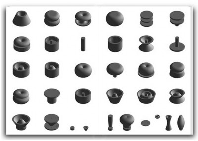
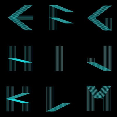
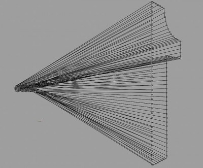
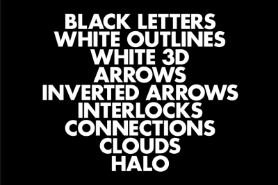
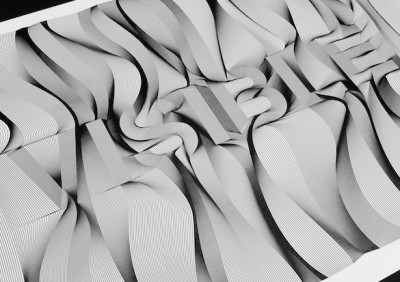
Univers Revolved by Ji Lee (Three-dimensional alphabet)

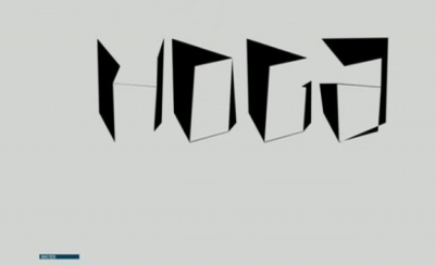
On/Off by Hoax (Series of typographic experiments)

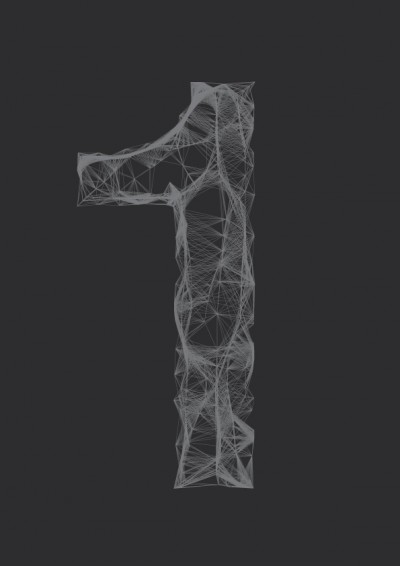
All The Dots, Document 1 by Alex Dipple (Conceptual Art)

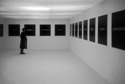
Projects 94 by Henrick Olesen (Installation at MoMA, NY)

Letter Flow by Roi Sabarov (Four-dimentional typography)

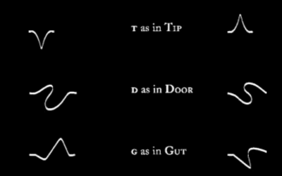
Takeluma by Peter Cho (Sound symbolic alphabet)


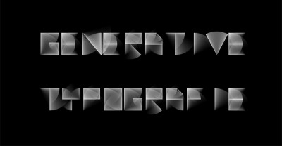
Generative Typografie at UoAS Mainz, Germany

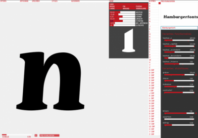
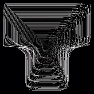
prototyp-0 by Yannick Mathey (Automated type design/ tool)

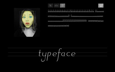
Process: Typeface by Randall Church (Generative Typography)

Lemniscate by Rosy Gorolova (Typeface)

Processing: Font code2 by Capo Luiz (Computational Typography)

one=1 by onebyone gallery (Installation)

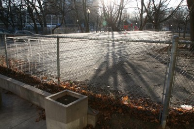
FREE by Sean Martindale (Installation)

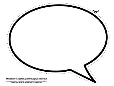
The Bubble Project by Ji Lee (Streetart)
Posted on September 12th, 2011.
Categories: Favorites, Generated, Installation, Interactive, Processing, Research, Tools, Writing.
...................................................................................................................................
Image links to projects:

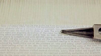
Font Of The Loom by Bertjan Pot (Woven typeface, Wikipedia text tablecloths)

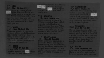
Illumination by Jack Kalish (Generative poetry installation)

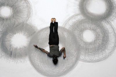
Penwald Drawings by Tony Orrico (The body as drawing tool)

9 Steps To Perfection by Dennis Payongayong

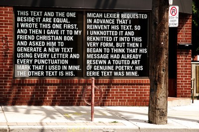
Collaboration between Micah Lexier and Christian Bok

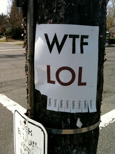
Useless Fliers by Josh Millard

ReFusing Fashion by Rei Kawakubo

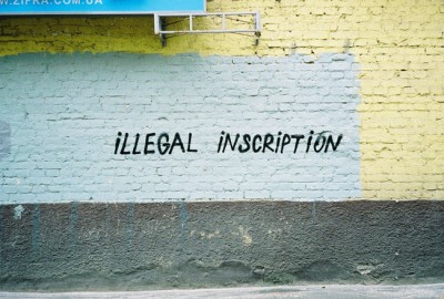
Spray on the wall by Sasha Kurmaz (Conceptual street art)

Typeface by Mary Huang (Generative type design)

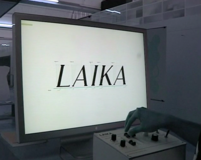
Laika by Nicolas Kunz and Michael Flückiger (Dynamic type design/ tool)

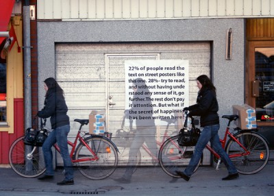
Good Typeface Is Invisible by cooee (Typographic poster design)

skNumber by Megumu Otani (Generative typography)

mis.shap.en.ness by Reza Ali (Generative typography)

Letter Mapping by Sam Ford (Generative Typography)

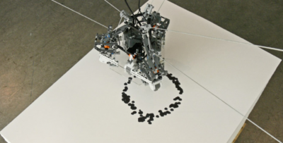
PenJet by Daniel Maarleveld, Jaan Evart, Julian Hagen (Printer head drawn type)
Posted on June 6th, 2011.
Categories: Favorites, Generated, Installation, Resources, Writing.
...................................................................................................................................
Image links to projects:

Lettering by Tania Alvarez

Typographic work by Christian Robert-Tissot

Paul Snowden at 7000WORDS

You’re Just My Type by Jonathan Brandel (inspired by TYPE+CODE and Pyramid Typeface)

Spatial Vibration developed in Olafur Eliasson’s studio

Roboter installation Dotje by Nils Völker and Christien Meindertsma

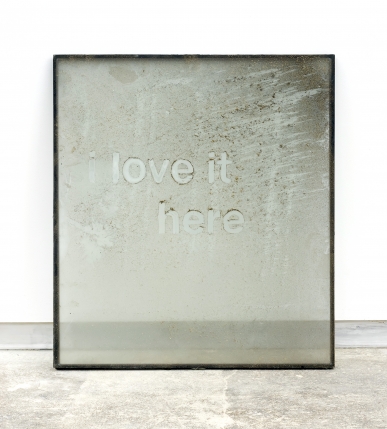
I love it by Ethan Breckenridge

Neon clock by Mouna Andraos

Character shop

Typographic film project Anthem for Absolut directed by Rupert Sanders

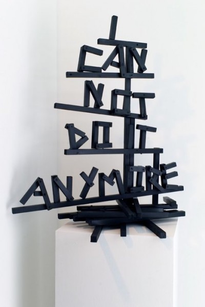
Wooden sculpture by Olaf Breuning

Public Poster Project by Egor Bashakov

Billboards by Tim Rehm and Tim Sürken

Various interactive typographic works by Jörg Piringer


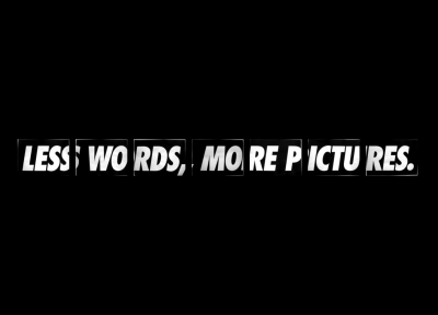
Pictures In Our Minds by Michael Schirner
Posted on August 13th, 2010.
Categories: Favorites, Generated, Installation, Interactive, Poster, Postscript, Processing.
...................................................................................................................................

http://www.conoranddavid.com/images/large/000003A.jpg
by Conor&David

http://mocoloco.com/art/archives/steinhilber_apr_05.jpg
by Dan Steinhilber

http://nymag.com/daily/entertainment/2008/07/video_street_artist_joshua_all.html
by Joshua Allen Harris
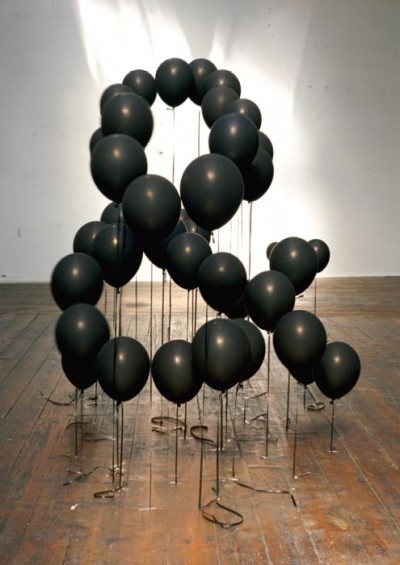
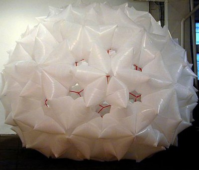
Dan Steinhilber works with all kinds of everyday materials and objects like trash-bags, bottles or paper-cloth-hangers. He uses them as modules or media to create abstract organic sculptures.
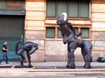
Street artist Joshua Allen Harris even brings his creatures made of garbage bags and tape to life.
He tapes them to a sidewalk grate and every time the subway passes the underground exhaust inflats and animates the sculpture that first just looked like ordinary trash on the street.
Posted on December 23rd, 2008.
Categories: Favorites, Inspiration, Installation, Research.
...................................................................................................................................

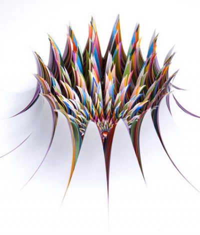
http://www.jenstark.com/sculpture_17.html
by Jen Stark

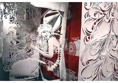
http://www.deitch.com/files/slideshows/swoon_work_5.jpg
by swoon

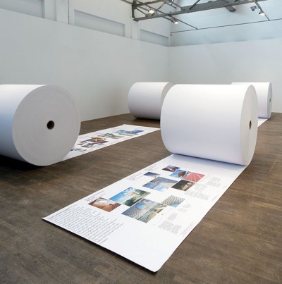
http://www.123buero.com/img/projects/PublicProjects/PublicProjects_06.jpg
by 123buero

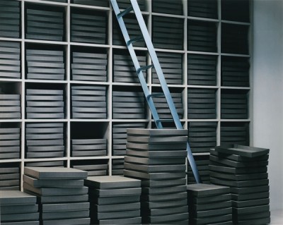
http://www.thomasdemand.de/
by Thomas Demand

http://www.fredriksterner.com/Bildmaterial/odetolaserprinter/laser3.jpg
by Fredrik Sterner

http://anfischer.com/wp-content/uploads/indizes/anfischer_indizes_1.jpg
by Andreas Fischer

http://www.deffekt.ch/wordpress/wp-content/gallery/p8/p7181409.jpg
by Martin Fuchs / deffect

http://www.pierrevanni.com/portfolio.jpg
by Pierre Vanni
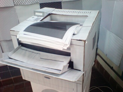
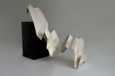
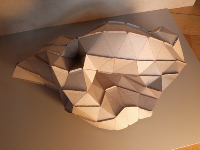
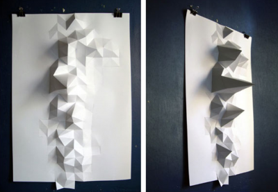
Paper sculpturing has become commonplace in contemporary visual culture. Paper is not only seen as planar two-dimensional canvas any more to write, print or draw on. It rather becomes an affordable and multi-functional material for uses such as building miniature models to sculpture surfaces and large scale objects. Artists using paper as their favorite medium come from very different fields. Swoon is part of an international street art scene but also gets featured in various galleries. On the street the decay of the material becomes part of the artwork what is not given in the gallery though. So location influences the aesthetics of her work.
In Thomas Demands photographic work, paper and location play a very different role. He uses paper to build exact models of locations that were specific happenings once took place. Lightning and perspective let the photographs look almost like reality.
The examples of Andreas Fischer and Martin Fuchs applied digital production methods and used data input to create specific shapes. Thus paper sculpture becomes a kind of physical representation of information graphs or mathematical calculation.
Robert Lang talks about Origami as art-form or form of sculpture which has been around for hundreds of years but totally changed it’s face once combined with mathematics. The mathematic rules of modern Origami however could be defined in simple four laws: The two colorability, at any interior vertex the ‘mountain-’ and ‘valley-folds’ always differ two, angles around a vertex sum up to a straight line and a sheet can never penetrate a fold (no self-intersection at overlaps).
These rules are as simple as an computer could understand them what makes Origami a mean of digital production, rapid prototyping and simulation not only in areas like science and technology.
To enable a kind of origami on demand Robert Lang developed ‘treemaker’ - a program to generate crease patterns after a given definition of a stick-figure-like version of one’s design. The basic principal of a crease pattern is to create as many flaps as needed for the final object so what ‘treemaker’ mainly does is to calculate and output the packing of circles on the sheet.
(www.ted.com/index.php/talks/robert_lang_folds_way_new_origami.html)
Posted on December 21st, 2008.
Categories: Favorites, Inspiration, Installation, Poster, Research, Theory.
...................................................................................................................................

One felt-pen isn’t even enough for one of my plots and some pens are more fitting than others, so the output is very unpredictable and also is the data within one graphic too much for processing on the plotter - that limits its usage decisively. Aesthetics are unique though…
Posted on December 16th, 2008.
Categories: Favorites, Poster, Progress.
...................................................................................................................................

http://farm4.static.flickr.com/3212/2739457894_2b10257c23_o.jpg
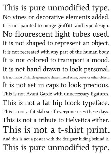
above: ‘This is pure unmodified type. No vines or decorative elements added. It is not painted to merge graffiti and type design. No fluorescent light tubes used. It is not shaped to represent an object. It is not recreated with any part of the human body. It is not colored to transport a mood. It is not hand drawn to look personal. It is not made of simple geometric shapes, metal scrap, books or other objects. It is not set in caps to look precious. This is not Avant-Garde with unnecessary ligatures. This is not a fat, hip block typeface. This is not a tribute to Helvetica either. This is not a t-shirt print. And this is not a poster with the designer hiding behind it. This is pure unmodified type.’
Posted on December 13th, 2008.
Categories: Favorites, Inspiration, Research, Theory.
...................................................................................................................................

http://farm2.static.flickr.com/1326/1151971874_6d3bb7a0fa.jpg?v=0
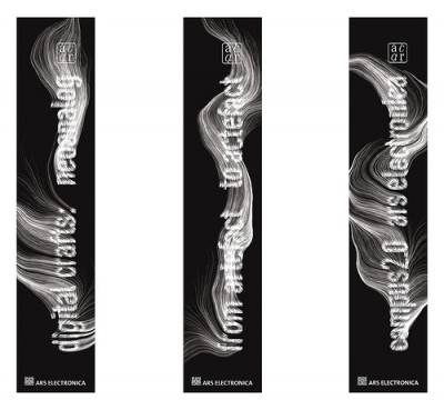
The Swiss Leander Herzog created a broad range highly inspiring and visually appealing designs mostly implemented with processing. He also digitally fabricated certain pieces and experimented with a drawing machine. Moreover he applied code to font design akin the banner title for the ‘ars electronica’ in 2007.
Posted on December 7th, 2008.
Categories: Favorites, Generated, Inspiration, Processing.
...................................................................................................................................

http://www.markushofer.at/img/24buchst.jpg
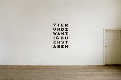
With further thoughts about self-reference in writing and conceptual art I found out that there are a view titles that reflect the Alphabet as their medium. Thus I came to a kind of Type Haiku:
Nine signs - Ten letters - Eighteen characters
Since one characteristic of the Alphabet in comparison to others is that you can translate various languages in it, I found the same Idea in German. Markus Hofer does some text-based art as well as installations or sculptures that point out our surrounding’s objects and media. His work ‘VIERUNDZWANZIG BUCHSTABEN’ (twenty four letters) does the same as described above.
Posted on November 7th, 2008.
Categories: Favorites, Progress, Research.
...................................................................................................................................

http://www.danielmaarleveld.nl/files/gimgs/16_speciman.jpg

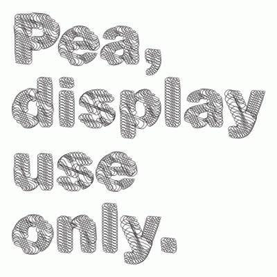
http://www.coreyholms.com/portfolio/31/pea.gif
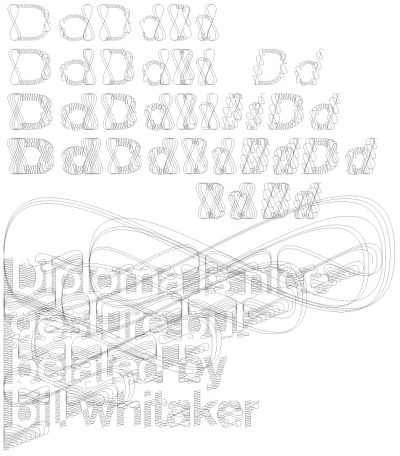
Daniël Maarleveld on his typeface: ‘Every tool has influence on how characters are formed. Think of: calligraphy or stencil-type. Digital tools, such as a filter, also have influence on typography. That’s how the diploma Akzidenz arose, A inbetween shape of the clear Akzidenz Grotesk and the excessive calligraphic visual interpretation of security paper and certificates.’
Corey Holms likewise designed the Font ‘Pea’. Her work probably involved another process and is based on the geometric Sans-Serif.
Posted on November 6th, 2008.
Categories: Favorites, Inspiration, Research.
...................................................................................................................................
