Posts categorized “Inspiration”.

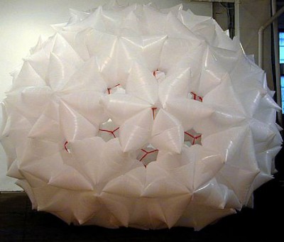
http://www.conoranddavid.com/images/large/000003A.jpg
by Conor&David

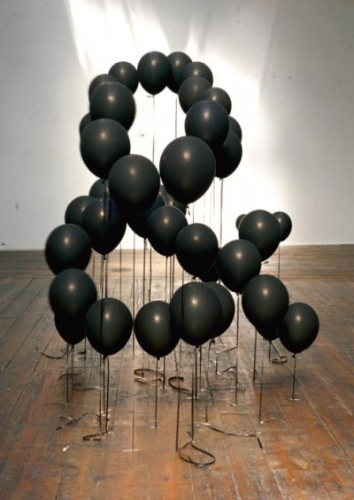
http://mocoloco.com/art/archives/steinhilber_apr_05.jpg
by Dan Steinhilber

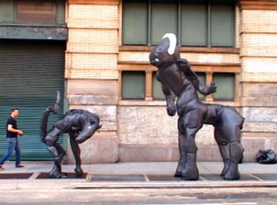
http://nymag.com/daily/entertainment/2008/07/video_street_artist_joshua_all.html
by Joshua Allen Harris
Dan Steinhilber works with all kinds of everyday materials and objects like trash-bags, bottles or paper-cloth-hangers. He uses them as modules or media to create abstract organic sculptures.
Street artist Joshua Allen Harris even brings his creatures made of garbage bags and tape to life.
He tapes them to a sidewalk grate and every time the subway passes the underground exhaust inflats and animates the sculpture that first just looked like ordinary trash on the street.
Posted on December 23rd, 2008.
Categories: Favorites, Inspiration, Installation, Research.
...................................................................................................................................

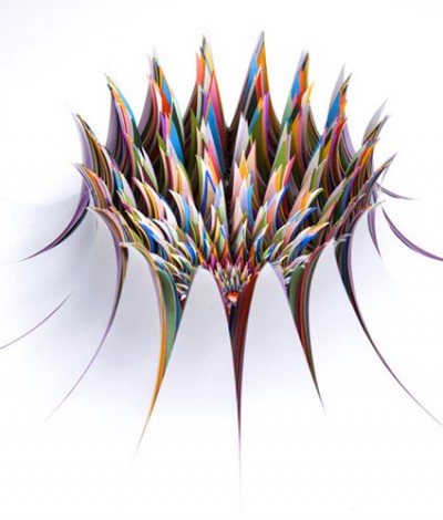
http://www.jenstark.com/sculpture_17.html
by Jen Stark

http://www.deitch.com/files/slideshows/swoon_work_5.jpg
by swoon

http://www.123buero.com/img/projects/PublicProjects/PublicProjects_06.jpg
by 123buero

http://www.thomasdemand.de/
by Thomas Demand

http://www.fredriksterner.com/Bildmaterial/odetolaserprinter/laser3.jpg
by Fredrik Sterner

http://anfischer.com/wp-content/uploads/indizes/anfischer_indizes_1.jpg
by Andreas Fischer

http://www.deffekt.ch/wordpress/wp-content/gallery/p8/p7181409.jpg
by Martin Fuchs / deffect

http://www.pierrevanni.com/portfolio.jpg
by Pierre Vanni
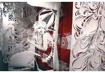
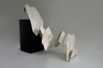
Paper sculpturing has become commonplace in contemporary visual culture. Paper is not only seen as planar two-dimensional canvas any more to write, print or draw on. It rather becomes an affordable and multi-functional material for uses such as building miniature models to sculpture surfaces and large scale objects. Artists using paper as their favorite medium come from very different fields. Swoon is part of an international street art scene but also gets featured in various galleries. On the street the decay of the material becomes part of the artwork what is not given in the gallery though. So location influences the aesthetics of her work.
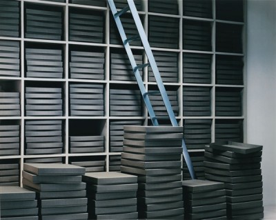
In Thomas Demands photographic work, paper and location play a very different role. He uses paper to build exact models of locations that were specific happenings once took place. Lightning and perspective let the photographs look almost like reality.
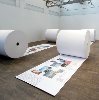
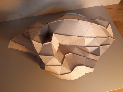
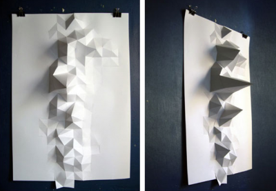
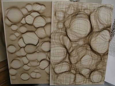
The examples of Andreas Fischer and Martin Fuchs applied digital production methods and used data input to create specific shapes. Thus paper sculpture becomes a kind of physical representation of information graphs or mathematical calculation.
Robert Lang talks about Origami as art-form or form of sculpture which has been around for hundreds of years but totally changed it’s face once combined with mathematics. The mathematic rules of modern Origami however could be defined in simple four laws: The two colorability, at any interior vertex the ‘mountain-’ and ‘valley-folds’ always differ two, angles around a vertex sum up to a straight line and a sheet can never penetrate a fold (no self-intersection at overlaps).
These rules are as simple as an computer could understand them what makes Origami a mean of digital production, rapid prototyping and simulation not only in areas like science and technology.
To enable a kind of origami on demand Robert Lang developed ‘treemaker’ - a program to generate crease patterns after a given definition of a stick-figure-like version of one’s design. The basic principal of a crease pattern is to create as many flaps as needed for the final object so what ‘treemaker’ mainly does is to calculate and output the packing of circles on the sheet.
(www.ted.com/index.php/talks/robert_lang_folds_way_new_origami.html)
Posted on December 21st, 2008.
Categories: Favorites, Inspiration, Installation, Poster, Research, Theory.
...................................................................................................................................

http://farm4.static.flickr.com/3212/2739457894_2b10257c23_o.jpg
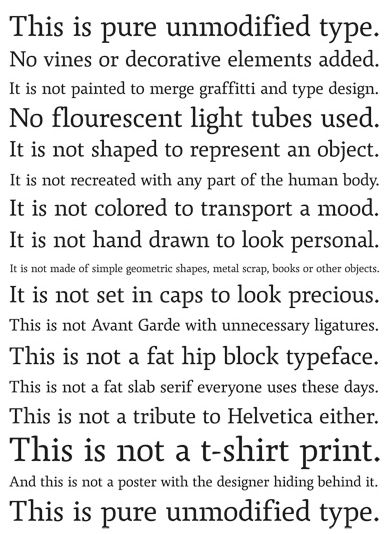
above: ‘This is pure unmodified type. No vines or decorative elements added. It is not painted to merge graffiti and type design. No fluorescent light tubes used. It is not shaped to represent an object. It is not recreated with any part of the human body. It is not colored to transport a mood. It is not hand drawn to look personal. It is not made of simple geometric shapes, metal scrap, books or other objects. It is not set in caps to look precious. This is not Avant-Garde with unnecessary ligatures. This is not a fat, hip block typeface. This is not a tribute to Helvetica either. This is not a t-shirt print. And this is not a poster with the designer hiding behind it. This is pure unmodified type.’
Posted on December 13th, 2008.
Categories: Favorites, Inspiration, Research, Theory.
...................................................................................................................................

http://farm2.static.flickr.com/1326/1151971874_6d3bb7a0fa.jpg?v=0
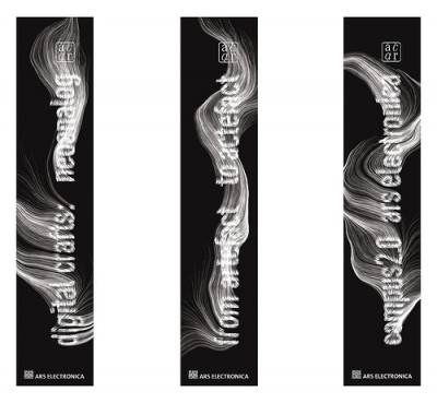
The Swiss Leander Herzog created a broad range highly inspiring and visually appealing designs mostly implemented with processing. He also digitally fabricated certain pieces and experimented with a drawing machine. Moreover he applied code to font design akin the banner title for the ‘ars electronica’ in 2007.
Posted on December 7th, 2008.
Categories: Favorites, Generated, Inspiration, Processing.
...................................................................................................................................

http://farm3.static.flickr.com/2032/2302101434_9fb4ef79fb.jpg?v=0
Today Marius Watz exhibited and talked in [DAM]Berlin Gallery.
Marius Watz is known for his work and teaching in generative art. His visual works use drawing machines, software implementations, large-scale projections or plastics. Moreover he curates Generator.x - ‘a conference and exhibition examining the current role of software and generative strategies in art and design.’ This platform is addressed to those using code as a mean of creative expression whereas his blog documents his activities such as the recent Workshop around Computational Typography (which will end on Thursday 27. Nov.) Here he also provides a list of links as references and resources to ease creating computational typography.
Posted on November 21st, 2008.
Categories: Generated, Inspiration, News, Research.
...................................................................................................................................

http://www.danielmaarleveld.nl/files/gimgs/16_speciman.jpg

http://www.coreyholms.com/portfolio/31/pea.gif
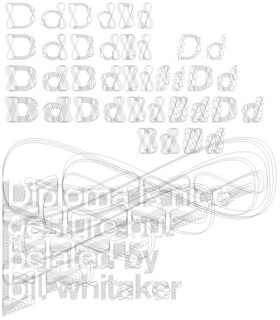
Daniël Maarleveld on his typeface: ‘Every tool has influence on how characters are formed. Think of: calligraphy or stencil-type. Digital tools, such as a filter, also have influence on typography. That’s how the diploma Akzidenz arose, A inbetween shape of the clear Akzidenz Grotesk and the excessive calligraphic visual interpretation of security paper and certificates.’
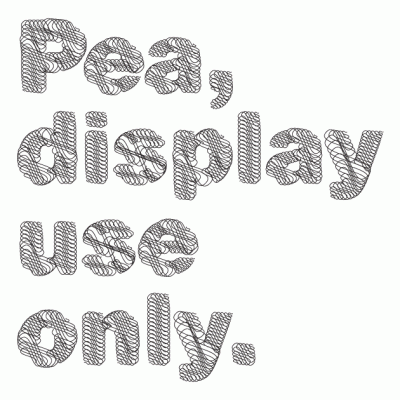
Corey Holms likewise designed the Font ‘Pea’. Her work probably involved another process and is based on the geometric Sans-Serif.
Posted on November 6th, 2008.
Categories: Favorites, Inspiration, Research.
...................................................................................................................................

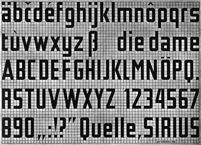
Since I prototyped my font design with ‘fontstruct’ which has an grid-based interface for shaping each letter, it might be worth mentioning that this approach obviously goes even back to Jan Tschichold and his ‘New Typography’ in the 30ies. This year typedesigner Sebastian Nagel recontructed Tschichold’s Typeface originally named ‘Leicht und Schnell Konstruierbare Schrift’ (A font easily and fast to construct) and translated it digitally. The end-product is Iwan Reschniev. (Sample pdf over fonts.info/info/iwan-reschniev.htm)
Posted on November 3rd, 2008.
Categories: Favorites, Inspiration, Research.
...................................................................................................................................

http://robseward.com/documentation/home/
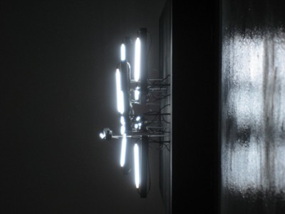
YWD contains of kinetic typographic sculpures made of wood, metal, fluorescent lights and electronics.
In certain moments the automated formation of the lights result the words ‘You’ ‘Will’ ‘Die’. Video on robseward.com/documentation/ywd
Posted on October 20th, 2008.
Categories: Inspiration, Installation, Research.
...................................................................................................................................

http://www.hansje.net/dropbox/Gaasletter.jpg
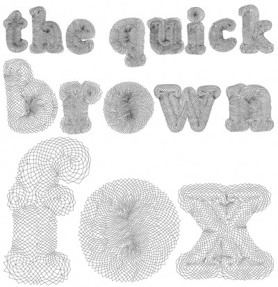
www.hansje.net shows digital letter designs by Hansje van Halem. His focus is on shapes built up with lines - black on white.
Posted on October 20th, 2008.
Categories: Inspiration, Research.
...................................................................................................................................

http://www.stefanbruggemann.com/work/images/tp/036.jpg
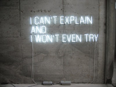
Stefan Brüggemann is one of the representatives of the neo-conceptual art movement who produces polemic and often provocative works mainly with texts or ‘ghost-words’. ‘Ghost-words’ he explaines are “those words that stay in your mind most of the time without making you say them out loud. I see those words blinking in neon in my mind, that’s why neon is the most mental medium. Another characteristics of those words is the dimension of time they contain. Have you ever spent enough time contemplating a certain word till it became something else?”
Probably best known is the artist for ‘Showtitles’: A list of suggestions for exhibition titles that can freely be used by anyone as long as they are credited to the artist. On the website each title is clickable so that you can listen to it spoken. Within an exhibition context they are displayed in black vinyl lettering on the wall. Other than that the media he uses ranges from photography, neon works, writing and film making to planning hotels or curating activities.
Stefan Brüggemann is interested in the void, ‘pictures that become words’ or other ‘words that become pictures’. He is interested in how certain issues “are reflected in all kinds of political or life-style slogans. Or to put it in other words”, he sais, “I am interested in the names of names.”
Asked about his ‘Text Pieces’ he states “The only thing that I could say about the Text Pieces is: what you read is what you get.”
(from interviews on stefanbruggemann.com/bibliography)
Posted on October 11th, 2008.
Categories: Favorites, Inspiration, Installation, Research.
...................................................................................................................................
