Posts categorized “Research”.
...................................................................................................................................Processing libraries
A new version (0150 BETA) of Processing got released today. It has many major changes to the previous (0148) and seems to have better support for vector and svg. Some libraries will have to be updated though. However - this gives me enough reason to list some of the libraries that drew my attention:
NextText (classes especially for text-based applications) uses TrueType fonts to render and display dynamic and interactive text.
(www.nexttext.net)
Geomerative (classes enabling extended 2D geometry operations)
also implements a TrueType font interpreter and importer to support the usage of typography in generative art.
(www.ricardmarxer.com/geomerative)
physics (classes enabling the simulation of physics) let you realize particle systems and forces more easily.
http://www.cs.princeton.edu/~traer/physics/
arcball (classes enabling easy 3D navigation) allows to freely rotate space along all three axes.
controlP5(classes enabling to implement controller easily) allows instant chance and feedback to different values for behavior parameters etc.
(www.sojamo.de/libraries/controlP5)
Stefan Brüggemann
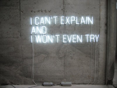
Stefan Brüggemann is one of the representatives of the neo-conceptual art movement who produces polemic and often provocative works mainly with texts or ‘ghost-words’. ‘Ghost-words’ he explaines are “those words that stay in your mind most of the time without making you say them out loud. I see those words blinking in neon in my mind, that’s why neon is the most mental medium. Another characteristics of those words is the dimension of time they contain. Have you ever spent enough time contemplating a certain word till it became something else?”
Probably best known is the artist for ‘Showtitles’: A list of suggestions for exhibition titles that can freely be used by anyone as long as they are credited to the artist. On the website each title is clickable so that you can listen to it spoken. Within an exhibition context they are displayed in black vinyl lettering on the wall. Other than that the media he uses ranges from photography, neon works, writing and film making to planning hotels or curating activities.
Stefan Brüggemann is interested in the void, ‘pictures that become words’ or other ‘words that become pictures’. He is interested in how certain issues “are reflected in all kinds of political or life-style slogans. Or to put it in other words”, he sais, “I am interested in the names of names.”
Asked about his ‘Text Pieces’ he states “The only thing that I could say about the Text Pieces is: what you read is what you get.”
(from interviews on stefanbruggemann.com/bibliography)
Type me, Type me not
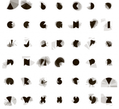
An early example of computational typography by Peter Cho.
Program online: acg.media.mit.edu/people/pcho/typemenot
Digital Fabrication
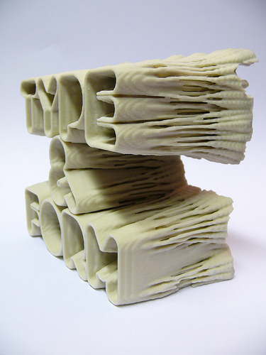
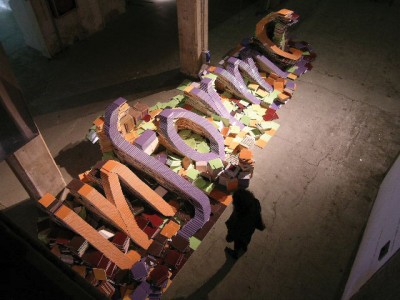
PostSpectacular realized the Print magazine August 2008 cover by designing and digitally fabricating a typographic sculpture using generative form giving. With this work they also indicated the changing scope of ‘print’. The process is part of the artwork and therefore documented as making-of on http://postspectacular.com/process/20080702_printmagcover
Typeworkshop.com
Typeworkshop.com shows various results of workshops by Underware, a design company specialized on type design and production. Students work with different media and show different approaches to thematic titles such as ‘darkmark’, ‘Movable Type’ or ‘Applied Type’.
Postscript as Programming Language
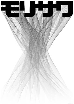
www.maedastudio.com/1996/gggkami/mori6.jpg
Some early work of John Maeda is done by Postscript programming. A series of posters show various examples.
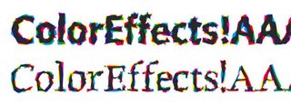
http://bp0.blogger.com/_jQ3w5UYYX5A/RaIP1wox03I/AAAAAAAAAAM/LlqyguU-qRU/s320/RandomFontColorEffects.jpg
Just van Rossum and Erik van Blokland (LettError) built the Typeface Beowolf as their first ‘RandomFont’.
They apply random functions to the letterforms when printing. Thus you get an individual shape for each letter. Computer fonts are rather dynamic programs than static forms. The two designers admit that the random aesthetic here is not that appealing, but the project was “proof that fonts were no longer physical objects but instructions.” (Interviews 1: Print, p.170, Processing. A Programming Handbook for Visual Designers and Artists, 2007 MIT)
http://www.letterror.com/content/nypels/randomfont.html
