Latest posts.

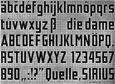
Since I prototyped my font design with ‘fontstruct’ which has an grid-based interface for shaping each letter, it might be worth mentioning that this approach obviously goes even back to Jan Tschichold and his ‘New Typography’ in the 30ies. This year typedesigner Sebastian Nagel recontructed Tschichold’s Typeface originally named ‘Leicht und Schnell Konstruierbare Schrift’ (A font easily and fast to construct) and translated it digitally. The end-product is Iwan Reschniev. (Sample pdf over fonts.info/info/iwan-reschniev.htm)
Posted on November 3rd, 2008.
Categories: Favorites, Inspiration, Research.
...................................................................................................................................

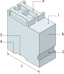
http://upload.wikimedia.org/wikipedia/commons/e/e9/Metal_type.svg
A widow’s a whore’s child…
I set up a basic English-German dictionary for technical terms around typography.
Listing on www.nohiddenmessage.com/index.php?/terms
Posted on November 3rd, 2008.
Categories: News, Research, Resources, Theory.
...................................................................................................................................

http://robseward.com/documentation/home/
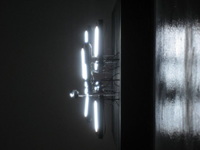
YWD contains of kinetic typographic sculpures made of wood, metal, fluorescent lights and electronics.
In certain moments the automated formation of the lights result the words ‘You’ ‘Will’ ‘Die’. Video on robseward.com/documentation/ywd
Posted on October 20th, 2008.
Categories: Inspiration, Installation, Research.
...................................................................................................................................

http://www.wordsarepictures.co.uk/images/hirsutura_550x700px.jpg
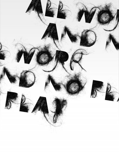
Craig Ward did a series of photographic typefaces to promote Fontlab’s ‘bitfonter’ software.
Posted on October 20th, 2008.
Categories: Research.
...................................................................................................................................

http://www.hansje.net/dropbox/Gaasletter.jpg
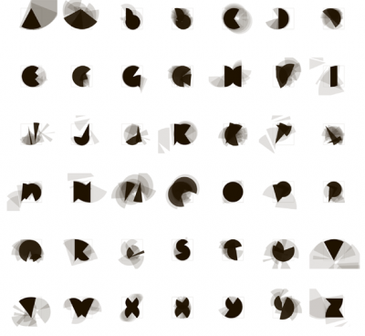
www.hansje.net shows digital letter designs by Hansje van Halem. His focus is on shapes built up with lines - black on white.
Posted on October 20th, 2008.
Categories: Inspiration, Research.
...................................................................................................................................

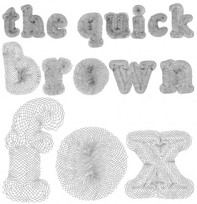
Eventually I have three different versions of the TrueType designed. The original one for usage on screen, print and as source of font outlines for programming. The second version is for plotting with a felt- or ball-pen. It consists of multiple lines to get a kind of hatching that makes a filled type when rendering. The third one is for cut outs and therefore contains gaps to leave some paper as the shapes become holes.
Posted on October 19th, 2008.
Categories: Favorites, Progress.
...................................................................................................................................


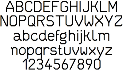
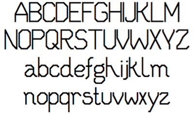
(On the top you see the final TrueType font whereas the image below shows the very first version)
The font was to be simple, clear, neutral. It should consist of unambiguous characters with good readability. Moreover the typeface should work fine in small point-sizes as well as in huge format - on the screen, in print and sculpture.
Because of different reasons a classic commercial font is not an option: First, because of the installation’s aspect of Zeitgeist - on one hand the installation should be timeless and matter-of-fact on the other hand it should suit a contemporary feeling for aesthetics (A font like Helvetica, Avenir or Blender are overused, impersonal and loaded with associations). A self-made font can be designed and adjusted to one’s actual and desired needs and does not involve any licensing or costs. An individual Type is therefore very important as it is the element on which all other designs base on. I decided to design an edgy font to get some suspenseful differences through varying sizes. Thus it also contains just straight lines and no curves what makes its coordinates easier to translate into different media.
A closer look at the font development shows that I started with more obviously varying shapes that formed a much more diversified face. In small continuous text or viewed from distance the first versions of the character set look too reserved and female though, so that I went on with more uniform and rather blunt letters. Other than that I mainly changed proportions.
To realize the TrueType I used the online application on fontstruct.com. Here you basically build up each character in a pixel-like grid and lets you choose between different modules for this. Finally it offers the possibility to apply ‘filters’ to the whole character set before generating a TrueType. I welcomed that since I could very much need that for easily generating a kind of line patterned font.
Fontstruct has limited features and conversion algorithms so that I needed to retouch the font with a font editor. I used the free software Font Forge for that purpose.
Posted on October 18th, 2008.
Categories: Favorites, Progress, Tools.
...................................................................................................................................

A new version (0150 BETA) of Processing got released today. It has many major changes to the previous (0148) and seems to have better support for vector and svg. Some libraries will have to be updated though. However - this gives me enough reason to list some of the libraries that drew my attention:
NextText (classes especially for text-based applications) uses TrueType fonts to render and display dynamic and interactive text.
(www.nexttext.net)
Geomerative (classes enabling extended 2D geometry operations)
also implements a TrueType font interpreter and importer to support the usage of typography in generative art.
(www.ricardmarxer.com/geomerative)
physics (classes enabling the simulation of physics) let you realize particle systems and forces more easily.
http://www.cs.princeton.edu/~traer/physics/
arcball (classes enabling easy 3D navigation) allows to freely rotate space along all three axes.
controlP5(classes enabling to implement controller easily) allows instant chance and feedback to different values for behavior parameters etc.
(www.sojamo.de/libraries/controlP5)
Posted on October 15th, 2008.
Categories: Processing, Programming, Research, Resources, Tools.
...................................................................................................................................

http://www.stefanbruggemann.com/work/images/tp/036.jpg
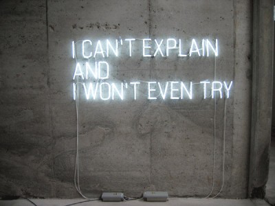
Stefan Brüggemann is one of the representatives of the neo-conceptual art movement who produces polemic and often provocative works mainly with texts or ‘ghost-words’. ‘Ghost-words’ he explaines are “those words that stay in your mind most of the time without making you say them out loud. I see those words blinking in neon in my mind, that’s why neon is the most mental medium. Another characteristics of those words is the dimension of time they contain. Have you ever spent enough time contemplating a certain word till it became something else?”
Probably best known is the artist for ‘Showtitles’: A list of suggestions for exhibition titles that can freely be used by anyone as long as they are credited to the artist. On the website each title is clickable so that you can listen to it spoken. Within an exhibition context they are displayed in black vinyl lettering on the wall. Other than that the media he uses ranges from photography, neon works, writing and film making to planning hotels or curating activities.
Stefan Brüggemann is interested in the void, ‘pictures that become words’ or other ‘words that become pictures’. He is interested in how certain issues “are reflected in all kinds of political or life-style slogans. Or to put it in other words”, he sais, “I am interested in the names of names.”
Asked about his ‘Text Pieces’ he states “The only thing that I could say about the Text Pieces is: what you read is what you get.”
(from interviews on stefanbruggemann.com/bibliography)
Posted on October 11th, 2008.
Categories: Favorites, Inspiration, Installation, Research.
...................................................................................................................................

http://typotopo.com/projects.php?id=typemenot
An early example of computational typography by Peter Cho.
Program online:
acg.media.mit.edu/people/pcho/typemenot
Posted on October 11th, 2008.
Categories: Interactive, Programming, Research.
...................................................................................................................................
