Latest posts.

http://farm3.static.flickr.com/2032/2302101434_9fb4ef79fb.jpg?v=0
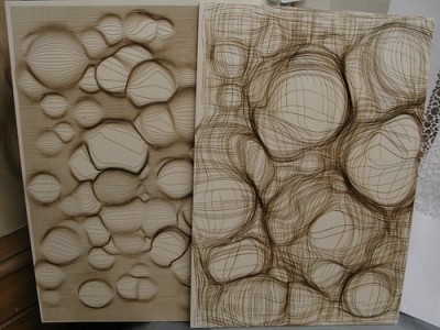
Today Marius Watz exhibited and talked in [DAM]Berlin Gallery.
Marius Watz is known for his work and teaching in generative art. His visual works use drawing machines, software implementations, large-scale projections or plastics. Moreover he curates Generator.x - ‘a conference and exhibition examining the current role of software and generative strategies in art and design.’ This platform is addressed to those using code as a mean of creative expression whereas his blog documents his activities such as the recent Workshop around Computational Typography (which will end on Thursday 27. Nov.) Here he also provides a list of links as references and resources to ease creating computational typography.
Posted on November 21st, 2008.
Categories: Generated, Inspiration, News, Research.
...................................................................................................................................

http://www.robotlab.de/bios/pics/bios-zkm04.jpg
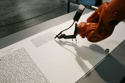
Robotlab uses robots to draw or write in the way of a human hand. The installation ‘bios [bible]‘ basically contains of an industrial robot equipped with a stylus and a number of paper scrolls. The robot writes down the bible’s text in a calligraphic script akin to those monks originally used to apply. He does this with immense precision throughout seven months to continue all 66 books.
The project is to reflect the link between Religion and Rationalism in which the Script had always played a special role. Further is explained that the very first script on a computer in the basic input output system (bios) means the origin for every function of the computer later on.
Video of robotlab at ZKM:
www01.zkm.de/robotlab/video/bios/bios-bible_02_480×360_h.mov
Posted on November 11th, 2008.
Categories: Installation, Research.
...................................................................................................................................

http://www.fionabanner.com/works/everywordunmade/image01.jpg

neuture.com/root/saved/114090207_776ec6a1f7_o.jpg

http://farm2.static.flickr.com/1415/1368261064_4cf9773d30_o.jpg

http://www.doggerfisher.com/uploads/pictures/529_large.jpg
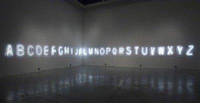
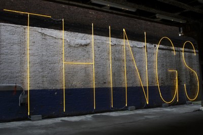
The neon alphabet on the top is an installation by Fiona Banner titled ‘every word unmade’. The impression of stuttered words is stressed by the unprofessional manufacturing: The letters clearly depict the artists struggle to control the media - the glass as well as the language.
Banner about her work: ‘I was thinking about a kind of unmaking of language. as if you could make every word, or story imaginable, from these 26 letters. All the potential is there, but none of the words.’
Posted on November 8th, 2008.
Categories: Installation, Research.
...................................................................................................................................

http://www.slanted.de/files/akzidenzseite07.jpg
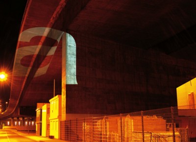
Tobias Battenberg explored how the Akzidenz Grotesque looks like when projected into urban environment.
He simply wanted to see whether the font looses its unique characteristics when set in extreme situations. So he went off and beamed large size characters with white light along bridges, through meshes, on buildings…
Posted on November 8th, 2008.
Categories: Research.
...................................................................................................................................

http://farm3.static.flickr.com/2395/2350000889_b67d58b7e3_o.jpg

http://a210.ac-images.myspacecdn.com/images01/34/l_715d50d825693c5094e5d28f38f02e41.jpg

http://stencilrevolution.com/photopost/data/501/4312best_things.jpg

www.bluejake.com

http://www.davidshrigley.com/images/photo_pics/lostfilofax-copy.jpg
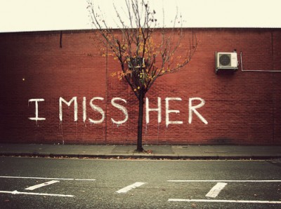
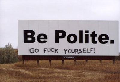
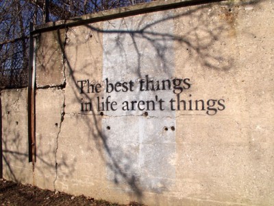
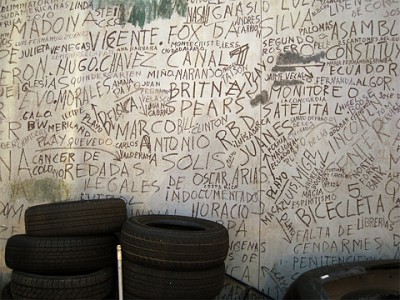
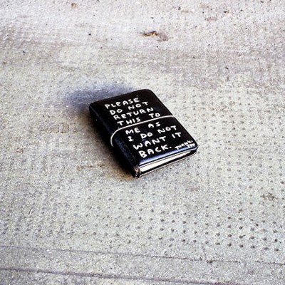
Street-art carries thoughts, identity and messages into public space. It is a form of art that had it’s origin in writing. Graffiti evolved from name-tags and brought forth it’s own interpretation of letters and words.
Today the range of activities in street-art is much wider but the simplicity and involvement of clear type remains intensive in it’s effect on passers-by. You can hardly look at a clear writing without ’seeing’ it - without having already read it. Typographic pieces that play with shapes and pictures allow to see the type on multiple layers freed from it’s semantics.
Posted on November 7th, 2008.
Categories: Research.
...................................................................................................................................

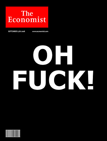
http://cache.gawker.com/assets/images/consumerist/2008/10/economistohfuck.jpg

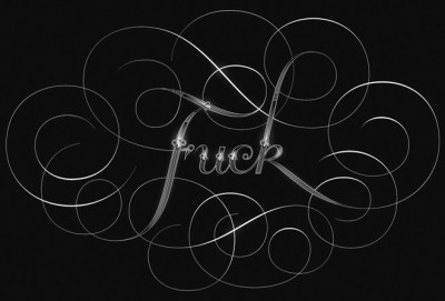
http://www.seblester.co.uk/core/assets/gallery/illustrations/photos/Indelicate_Web.jpg

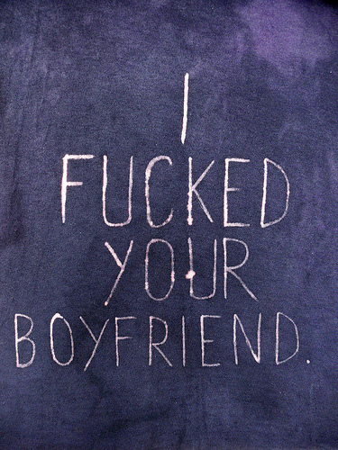
http://farm2.static.flickr.com/1071/622915195_b51ccd3622.jpg?v=0

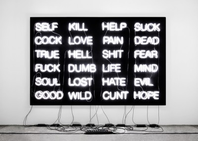
http://www.v1gallery.com/artistimage/image/353/8.SonneFourLetterWords.jpg?1220367030
Posted on November 7th, 2008.
Categories: Research.
...................................................................................................................................

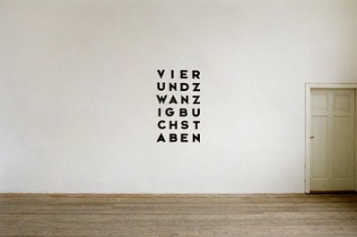
http://www.markushofer.at/img/24buchst.jpg
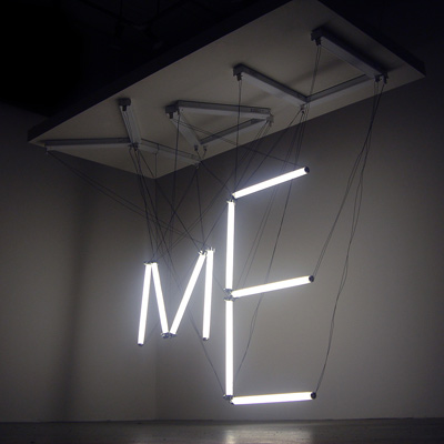
With further thoughts about self-reference in writing and conceptual art I found out that there are a view titles that reflect the Alphabet as their medium. Thus I came to a kind of Type Haiku:
Nine signs - Ten letters - Eighteen characters
Since one characteristic of the Alphabet in comparison to others is that you can translate various languages in it, I found the same Idea in German. Markus Hofer does some text-based art as well as installations or sculptures that point out our surrounding’s objects and media. His work ‘VIERUNDZWANZIG BUCHSTABEN’ (twenty four letters) does the same as described above.
Posted on November 7th, 2008.
Categories: Favorites, Progress, Research.
...................................................................................................................................

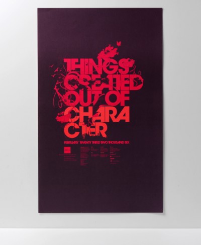
http://www.charactersf.com/images/19231115.aiga_1.jpg
‘Character’ in English has various meanings. The sign, the nature of something, the symbol, the person, the personality and the letter to name just a few. However here it also means the name of the design agency.
Posted on November 7th, 2008.
Categories: Poster, Research.
...................................................................................................................................

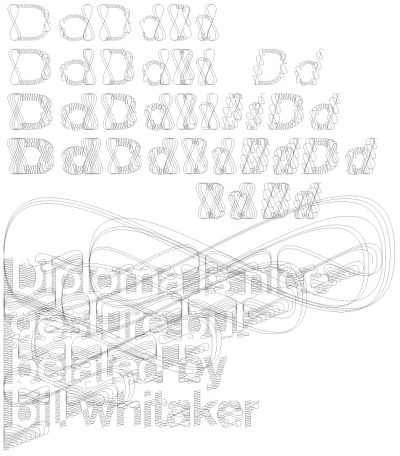
http://www.danielmaarleveld.nl/files/gimgs/16_speciman.jpg

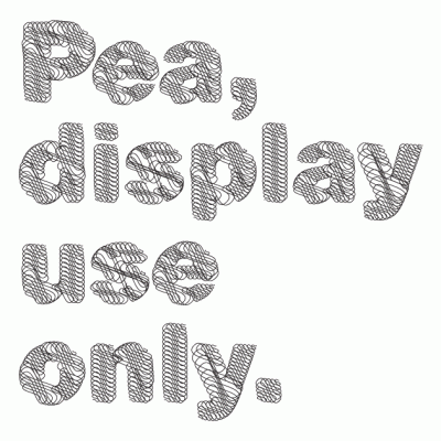
http://www.coreyholms.com/portfolio/31/pea.gif
Daniël Maarleveld on his typeface: ‘Every tool has influence on how characters are formed. Think of: calligraphy or stencil-type. Digital tools, such as a filter, also have influence on typography. That’s how the diploma Akzidenz arose, A inbetween shape of the clear Akzidenz Grotesk and the excessive calligraphic visual interpretation of security paper and certificates.’
Corey Holms likewise designed the Font ‘Pea’. Her work probably involved another process and is based on the geometric Sans-Serif.
Posted on November 6th, 2008.
Categories: Favorites, Inspiration, Research.
...................................................................................................................................

http://www.youdontmatter.com/files/gimgs/5_b03.jpg
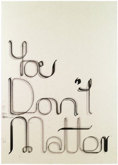
After a workshop by Jürg Lehni, among who’s works are Hektor and Scriptographer, ‘You don’t matter’ converted a plotting machine into an device to draw, scratch or cut with traditional drawing measures. The goal was to combine aesthetics of hand drawings and computer aided design. With analogous tools as well as computational errors you get imperfectness and individuality.
Posted on November 4th, 2008.
Categories: Favorites, Poster, Research.
...................................................................................................................................
