Posts categorized “Research”.

http://www.jonathanpuckey.com/projects/the-classroom/resources/cl-jeanmarc1.jpg?thumb=36ee3320b8a1cee832f900f8daca118b
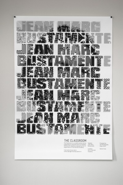
Amsterdam based digital designer Jonathan Puckey created some own tools for his various works around type and text. Amongst his used media is Scriptographer that I mentioned before.
Posted on December 11th, 2008.
Categories: Poster, Research.
...................................................................................................................................

http://www.ted.com/index.php/talks/tim_brown_on_creativity_and_play.html
Last month TED posted a video of Tim Brown’s presentation on the link between creativity and play.
The approach he pictures seems very important to me and the problems he explains I experienced before. With my thesis project - as I intended to do a work that needs to include play as a decisive part of the process I put myself in a somehow vulnerable position because play and imperfectness tend to be seen as the contrary to profession. And in most schools, businesses and graphic design platforms profession gains the most respect…
Tim Brown says the reason because many adults can’t be playful easily is the fear of failure or bad critique. Compared to children grown-ups loose the freedom and trust in their environment and tend to conservative thinking. But designers need to play and therefore to take risks. So this makes it very important for them to act in an environment they can trust. Playfulness is important because it eases the process to come up with creative ideas, it opens opportunities and supports productivity. There are three main categories of play: exploration, construction play and role play.
Exploration is about quantity. A classic example is to look for as many usages for a paper-clip as possible. It is about forgetting the original goal but exploring what is interesting for one. But as this behavior is against adult habits we have to relearn openness and playfulness and it does not make sense to introduce rules to break the rules such as brainstorming guides. Experiments explore possibilities and also physical objects.
Construction- or building-play means thinking with ones hands and is very effective and useful for production stages like rapid prototyping. It helps to communicate about a specific product or such when you have a dummy to talk about even when its just taped together from random things from around the work-space. Here it becomes obvious that another obstacle for adults remaining playful is that all kind of ‘play-tools’ get lost in schools with each level of school.
Role acting is another way to experience your environment and one can simulate case studies or play through scenarios.
Adults are very reluctant to engage though. This is partly embarrassment again or they don’t believe that what emerges is necessarily valid. The social scripts kids follow in role plays show that it is worth taking serious and adults experienced many situations throughout their lives so that they have a huge set of role play scripts already internalized - so we are very good in acting out an solution. Another aspect is that it facilitates to imagine a specific surrounding one is designing for. Besides simulation you could do role play in the real world as well. By documenting an experience you are going through even unintended emphasis happens on specific aspects you might have not noticed before.
Eventually Tim Brown stresses a few points about play:
Play is not anarchy. (Play has rules, especially group play)
There are rules about when to play. (There should be transitions between experiences)
In design one goes through two distinctive modes of operation - the generative mode and the creative mode (exploring and creating)
You can be playful and professional/serious at once
Posted on December 9th, 2008.
Categories: Methodology, Research, Theory.
...................................................................................................................................

http://www.clementgallet.com/archive/print/afterwork2/02.jpg
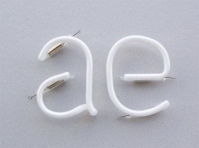
Clement Gallet collaborated with a neon constructor to design a digital font, ‘afterwork’, from a neon type sample. He translated the typical forms of the shaped material into letters.
Posted on December 9th, 2008.
Categories: Research.
...................................................................................................................................
End of November the first non-beta version of Processing (1.0) got released. With it I am using the latest version of Geomerative now (ref 19). Ricard Marxer was so kind as to provide additional functions for me so that I could translate some
fundamental functionality from my previous code.
The preceding versions have features though that I appreciate and that’s why I will keep working with them. Intersection works well and contours have no closure - essential aspects when line-drawing.
Font-metrics and -formatting seem still be some rare topics among programmers. I can apply kerning by bringing in the kerning-pair information out of the metrics file of a font. And I did some very basic alignment for body text that suits my needs. At the same time Christian Rieckoff was working on automatic line-breaking in java what might be worth a bookmark for future plans. (texone.org/?p=43)
Christian Rieckhoff educates at the UDK Berlin and held a Processing course on digital fabrication in Summer in which he provided some very helpful code examples.
Posted on December 7th, 2008.
Categories: News, Processing, Programming, Research, Resources.
...................................................................................................................................

https://www.beholder-art.com/img/dynamic/artist/artwork/large//783.phpvjBOcF
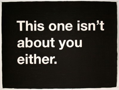
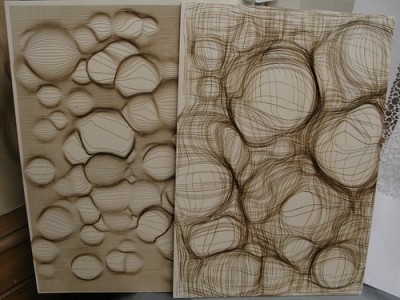
The drawings of Mike Monteiro are mainly achieved with black gouache painted texts on white paper. His words seem very much like thoughts you easily can identify with or which draw scenes or emphasize the multiple semantics of words when separated from their context.
Posted on December 7th, 2008.
Categories: Research.
...................................................................................................................................

http://www.pbs.org/art21/slideshow/popup.php?slide=1475#
Jenny Holzer’s medium is writing. Wheather it is street posters, LED, projections or everyday objects like T-shirts or cups.
The artist’s writings are truisms, sayings, various statements appearing as poetry-like phrases. But Holzer clearly distinguishes her art from poetry or literature in general because ‘it has to do with the demands of the medium on which I place it.’ By applying media that is commonly used in advertising she found a way to communicate explicit statements about society in a minimalistic manner and to question how those media affect information.
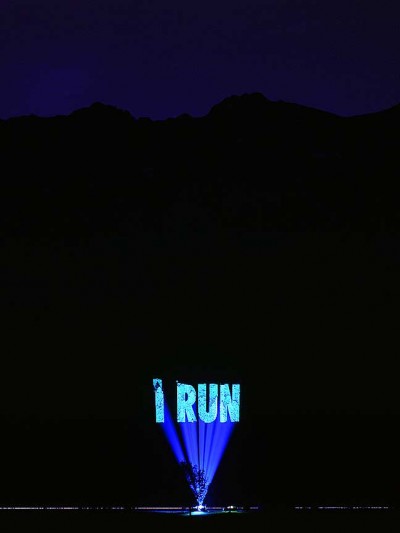
With Xenon light she is also able to create large environmental projections on buildings or landscapes.
Until New Year 2009 the Guggenheim in New York as well features Jenny Holzer’s work on the outstanding facade of the museum.
www.guggenheim.org/new-york/exhibitions/on-view-now/for-the-guggenheim
An example of her usage of online media is ‘please change believes’ where you can edit and contribute truisms. adaweb.walkerart.org/project/holzer/cgi/pcb.cgi
Posted on December 3rd, 2008.
Categories: Installation, News, Research, Theory.
...................................................................................................................................

http://farm3.static.flickr.com/2032/2302101434_9fb4ef79fb.jpg?v=0
Today Marius Watz exhibited and talked in [DAM]Berlin Gallery.
Marius Watz is known for his work and teaching in generative art. His visual works use drawing machines, software implementations, large-scale projections or plastics. Moreover he curates Generator.x - ‘a conference and exhibition examining the current role of software and generative strategies in art and design.’ This platform is addressed to those using code as a mean of creative expression whereas his blog documents his activities such as the recent Workshop around Computational Typography (which will end on Thursday 27. Nov.) Here he also provides a list of links as references and resources to ease creating computational typography.
Posted on November 21st, 2008.
Categories: Generated, Inspiration, News, Research.
...................................................................................................................................

http://www.robotlab.de/bios/pics/bios-zkm04.jpg
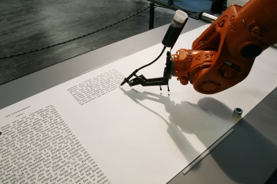
Robotlab uses robots to draw or write in the way of a human hand. The installation ‘bios [bible]‘ basically contains of an industrial robot equipped with a stylus and a number of paper scrolls. The robot writes down the bible’s text in a calligraphic script akin to those monks originally used to apply. He does this with immense precision throughout seven months to continue all 66 books.
The project is to reflect the link between Religion and Rationalism in which the Script had always played a special role. Further is explained that the very first script on a computer in the basic input output system (bios) means the origin for every function of the computer later on.
Video of robotlab at ZKM:
www01.zkm.de/robotlab/video/bios/bios-bible_02_480×360_h.mov
Posted on November 11th, 2008.
Categories: Installation, Research.
...................................................................................................................................

http://www.fionabanner.com/works/everywordunmade/image01.jpg

neuture.com/root/saved/114090207_776ec6a1f7_o.jpg

http://farm2.static.flickr.com/1415/1368261064_4cf9773d30_o.jpg

http://www.doggerfisher.com/uploads/pictures/529_large.jpg
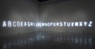
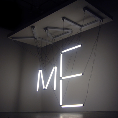
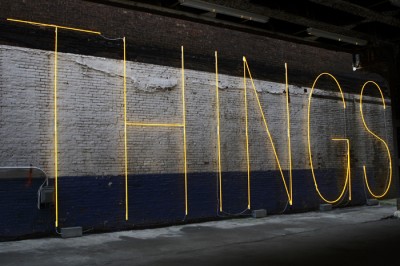
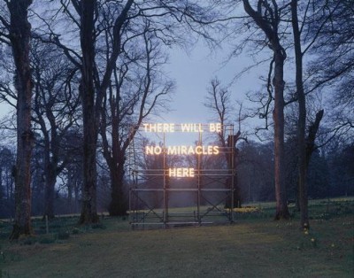
The neon alphabet on the top is an installation by Fiona Banner titled ‘every word unmade’. The impression of stuttered words is stressed by the unprofessional manufacturing: The letters clearly depict the artists struggle to control the media - the glass as well as the language.
Banner about her work: ‘I was thinking about a kind of unmaking of language. as if you could make every word, or story imaginable, from these 26 letters. All the potential is there, but none of the words.’
Posted on November 8th, 2008.
Categories: Installation, Research.
...................................................................................................................................

http://www.slanted.de/files/akzidenzseite07.jpg
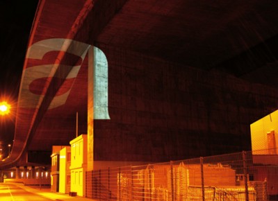
Tobias Battenberg explored how the Akzidenz Grotesque looks like when projected into urban environment.
He simply wanted to see whether the font looses its unique characteristics when set in extreme situations. So he went off and beamed large size characters with white light along bridges, through meshes, on buildings…
Posted on November 8th, 2008.
Categories: Research.
...................................................................................................................................
