Posts categorized “Installation”.

http://www.typeworkshop.com/Florence_12_2005/final-result/florence-final-07.jpg
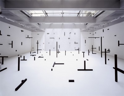
Typeworkshop.com shows various results of workshops by Underware, a design company specialized on type design and production. Students work with different media and show different approaches to thematic titles such as ‘darkmark’, ‘Movable Type’ or ‘Applied Type’.
Posted on October 10th, 2008.
Categories: Inspiration, Installation, Research.
...................................................................................................................................

http://www.estherstocker.net/images%20gross/3installationen/6stocker_khwien.jpg

http://www.estherstocker.net/images%20gross/3installationen/5stocker_taxis2.jpg
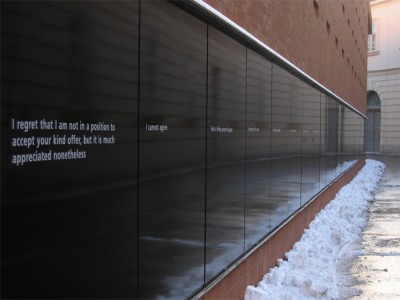
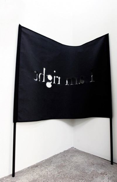
The project wall ‘I’m afraid I must refuse’ (2005, Kunsthalle Wien) contains of 47 sentences refusing a request. The very graphic - almost typographic - appearing installation on the picture below is made with painted wood.
Posted on September 26th, 2008.
Categories: Installation, Research.
...................................................................................................................................

http://www.sandysmith.co.uk/artwork/computers/sunset/sandy_smith_sunset_01.jpg

http://www.sandysmith.co.uk/artwork/poststuckism/image5.html
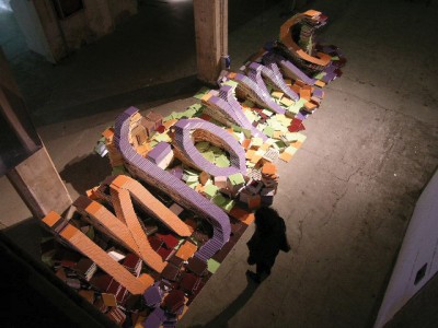
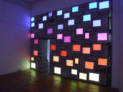
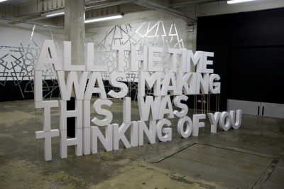
Sandy Smith’s ‘Mauritian Sunset’ is a wall of computers and screens and ‘Please don’t break my heart’ was made from around 100 sheets of mounting board glued together to form the sentence “All the time I was making this I was thinking of you”. It fell during the exhibition as it could not stand without scaffolding. I think in combination with the title and the text this unintended transformation due to the physical construction becomes a significant part of the art work.
Posted on September 26th, 2008.
Categories: Favorites, Inspiration, Installation, Research.
...................................................................................................................................

http://www.tsangkinwah.com/image/megART7.jpg
TSANG Kin-Wah makes wall installations in the form of taped text or text-patterns.
Posted on September 26th, 2008.
Categories: Inspiration, Installation, Research.
...................................................................................................................................

http://www.designboom.com/contemporary/neto/7.jpg

http://www.acegallery.net/artists/donovan/TD-UntCupsLA.jpg

http://maxprotetch.com/MEDIA/00178.jpg

http://www.re-title.com/public/exhibitors/936/archive_1940_TanyaBonakdarGallery-2.jpg
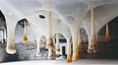
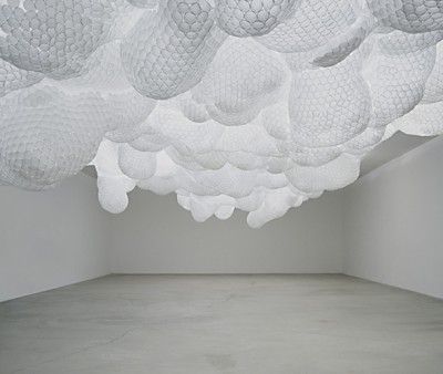
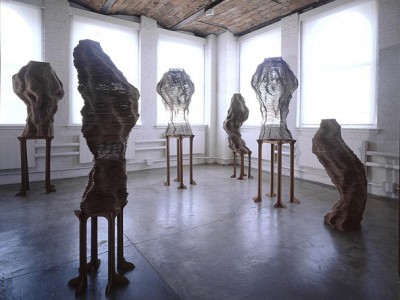
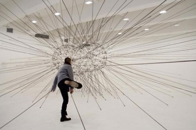
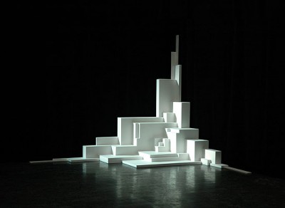
Artist work in the field of installation and sculpture: Ernesto Neto, Tara Donovan, Tomas Saraceno and Tobias Putrih give examples of creative space, usage of materials with high availability and modular construction.
Ernesto Neto is mostly working with light, flexible fabrics in nylon or cotton resulting in spaceous installations whereas Tara Donovan uses various everyday materials such as tape, drinking straws or plastic cups to form large-scale abstract floor and wall works.”She considers patterning, configuration, and the play of light when determining the structure of her works but the final form evolves from the innate properties and structures of the material itself.”(Hammer Museum, Los Angeles 2004) Tomas Saraceno used elastic rope to realize installations like ‘Galaxies Forming ALong Filaments, Like Droplets Along the Strands of a Spider’ which I got to see in New York this year. Among Tobias Putrih’s work especially the usage of cardboard or projection screens are interesting references.
Posted on September 25th, 2008.
Categories: Favorites, Inspiration, Installation, Research.
...................................................................................................................................

http://www.pablovalbuena.com/imgs/quebec.jpg

http://www.framebox.de/creations/3d/edges/till_stefan.jpg
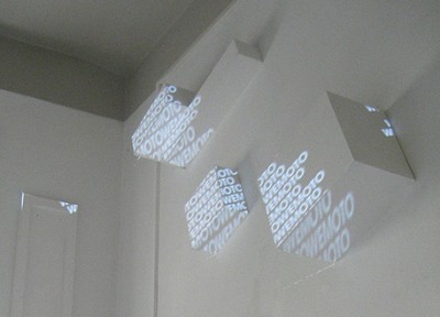
With his
augmented sculptures and urban installation Pablo Valbuena shows great effect with a simple method. A combination of light and object at it’s best. Stefan Golz and Till Nowak were doing some light installations with a similar idea. They also used some typographic elements in
Edges but ulike Pablo Valbuena they did not project them considering the three-dimensional distortion of the projection.
Posted on September 21st, 2008.
Categories: Favorites, Inspiration, Installation, Research.
...................................................................................................................................

http://www.v1gallery.com/artistimage/image/363/19.SonneSignLanguage_2.jpg?1220367545
The danish artist Kasper Sonne works with various media such as photography, wall painting, neon, paper, textile to create sculptures or installations with text.
One of his works - “The beginning is the end and the end is the beginning” is a slide projection that continuously shifts between the words “fear, your, control, your…” - The statement can be read as “control your fear” or “fear your control”, depending on where the spectator starts to read.
Kasper Sonne 2007 (PDF)
Posted on September 21st, 2008.
Categories: Installation, Research.
...................................................................................................................................

http://konradfischergalerie.de/media/20080827170856.jpg
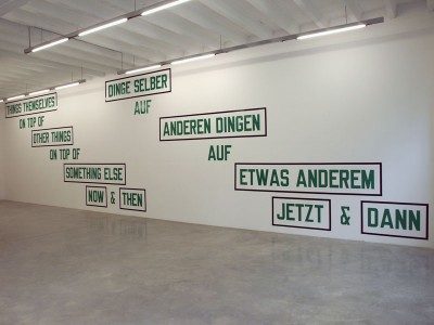
This night Konrad Fischer Gallery was hosting a talk with Lawrence Weiner, one of the main actors in the field of Conceptual Art. His sculptures are mostly typographic texts as shown in his current exhibition.
Weiner was talking about art and society and their change in general, what art means or what art is not (something in secret for example is not art) what the artist does or wants (to put something in the world, make his art accessible and affect its environment - to not fuck up somebody’s day but somebody’s life, to not telling somebody something but show, …)
Here briefly what I extracted for myself of what he was talking about language as medium as well as his experience of working with type: (Partly in reference to his currently featured work)
Translation plays a significant role in his international exhibitions and he explains that one obstacle is that everything has a double meaning (e.g. end has several meanings and is therefore hard to use) and that sometimes it seems even harder to translate text than an image, but he wouldn’t want that just one language is spoken. (A question like “How do you handle something new?” for example almost couldn’t be translated into Arabic or Hebrew)
Language is just another tool - it’s his oil. He uses language also for the reasons that it is accessible and pragmatic. It says what it says.
Language is as sensual as touch. You don’t have language “inside you” - you don’t possess it like smell or touch. You rather have the object in you and as you start to name things you use language. (children speak in another language until they get forced to speak the commonly learned language) And to that level he brings his art - where you give things names.
The text is object.
Lawrence Weiner has no quotes in his work - he sometimes finds paraphrases appropriate but he clearly states that putting a phrase of Goethe on a wall doesn’t make an artist.
See it as a message in a bottle - it’s up to you what you do with the message and you can see the bottle as the society.
Besides words he also uses graphics or special characters such as parenthesis or brackets, they are also language and say things.
It always took some effort to find the right typeface after the last one got overused by communication design and he couldn’t manage to create an computable font himself.
Artist Series: Lawrence Weiner (Video by Hillman Curtis)
Posted on September 20th, 2008.
Categories: Installation, Research, Theory.
...................................................................................................................................
